thrivesparrow.com
Landing Page Analysis
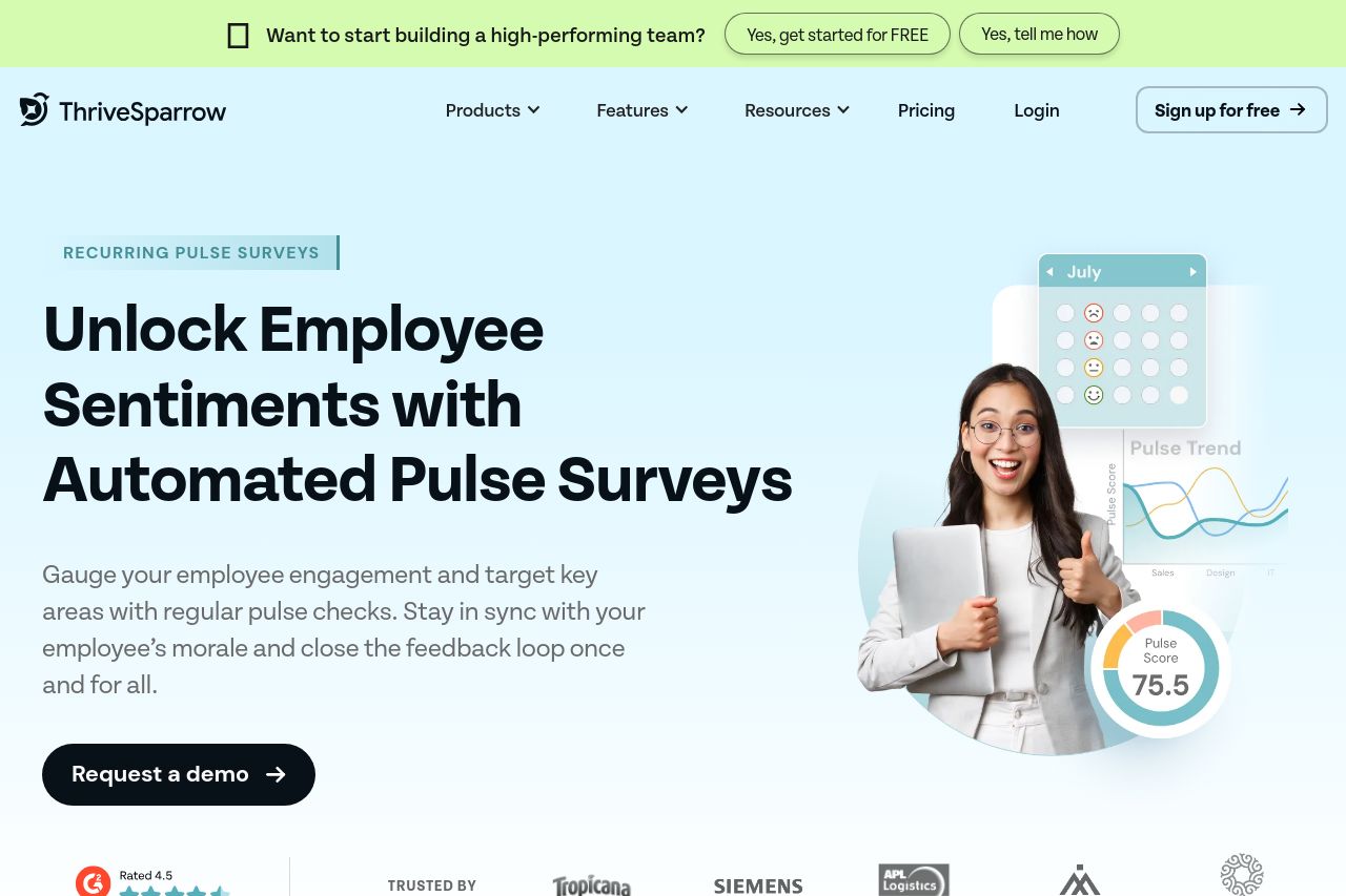
Keep your team motivated and informed with recurring pulse surveys. Gain valuable insights, track employee satisfaction, and foster a thriving workplace culture.
Summary:
ThriveSparrow's landing page is a mix of effective and less impressive elements. The design feels fresh and modern with adequate white space, but the value proposition is somewhat hidden in jargon, making it less accessible. Visual content like charts and animations effectively convey complex ideas, assisting with audience understanding, yet the text sometimes gets lost due to inconsistency in font sizes and insufficient emphasis on priorities. CTAs are generally well-placed and action-oriented, but there are moments where their design makes them blend too much with surrounding text. Social proof with client logos adds to credibility, though additional personalized testimonials could further this. The Open Graph lacks engaging appeal; a more impactful visual or critical info could be highlighted to maximize click-through.
- Simplify the value proposition to make it crystal clear what the product does.
- Introduce more variation in typography to emphasize key points and increase engagement.
- Optimize the Open Graph with stronger visuals and more enticing descriptions.