thrivesparrow.com
Landing Page Analysis
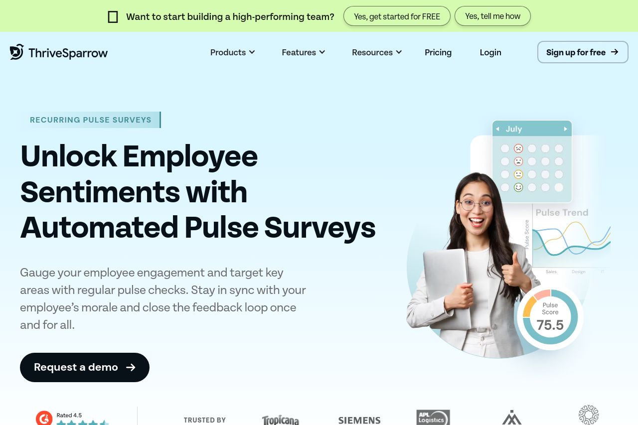
Keep your team motivated and informed with recurring pulse surveys. Gain valuable insights, track employee satisfaction, and foster a thriving workplace culture.
81
Generated on:
October 3, 2025Score:
81/100Share on:
Summary:
60
Messaging
75
Readability
90
Structure
65
Actionability
85
Design
90
Credibility
ThriveSparrow's landing page is a mix of effective and less impressive elements. The design feels fresh and modern with adequate white space, but the value proposition is somewhat hidden in the middle of complex jargon. There's a good use of visuals, particularly the infographic-style elements, but some parts feel cluttered, like the long informational text blocks. Header text clearly outlines benefits, yet doesn't fully engage the audience. Overall, good design foundations, but the messaging needs a clear and strong structure to maintain user interest.
Main Recommendations:
- Clarify the value proposition in simple terms.
- Improve CTA placement for better visibility.
- Enhance visual hierarchy by using more distinct headings.