thrivesparrow.com
Landing Page Analysis
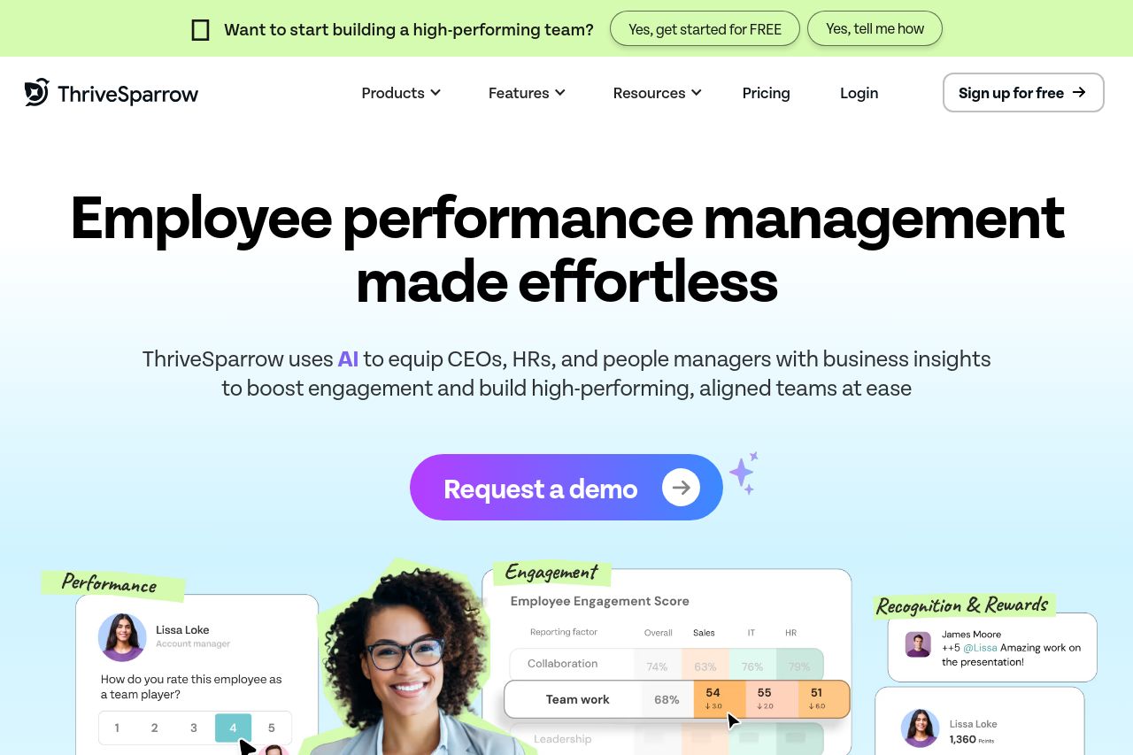
ThriveSparrow is a continuous employee success platform that enables companies to build a high-performing unified workforce. Embark on a thriving journey now.
Summary:
Overall, the ThriveSparrow landing page balances a clean, professional design with some evident areas for improvement. The messaging is generally clear, focusing on employee success and management, which is reinforced by the strategic use of language catered towards HR professionals and managers. However, the tone occasionally feels too formal and lacks a touch of warmth—a more engaging approach could enhance user connection. The design palette is modern and supportive of the brand's personality, yet it sometimes feels overly safe, missing opportunities for a bolder engagement. Additionally, while the structure is mostly logical, some redundancy in call to actions may distract users. The credibility aspect is solid, with numerous trust elements like testimonials and logos, contributing to a trustworthy feel.
The readability of the site is mostly commendable, although the excessive similarity in text size and weight might affect the overall reading experience. More variety could support a stronger visual hierarchy. In terms of actionability, the CTAs are generally relevant and well-placed, but the repeated "Book a demo" can cause confusion, slightly overshadowing the main conversion goal.
- Diversify the tone to add warmth and personality to the messaging, making it more engaging for users.
- Increase visual hierarchy by varying text size and weight to make key messages stand out more distinctly.
- Reduce redundancy in CTAs to keep the focal point clear and avoid overwhelming the user with options.