surveysparrow.com
Landing Page Analysis
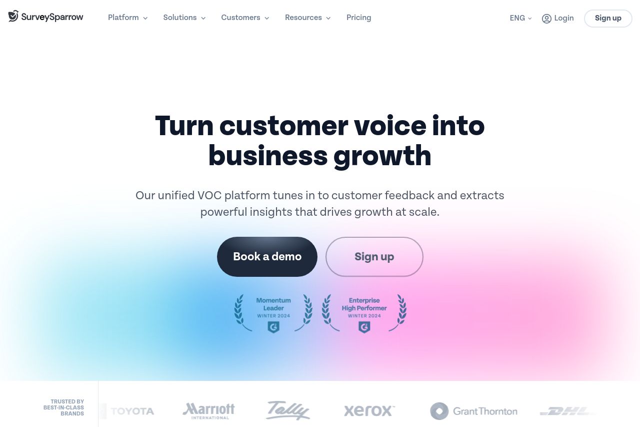
SurveySparrow’s online survey tools and forms refine and enhance customer experiences with actionable insights. Be the brand customers love! Try for FREE today.
80
Share on:
Summary:
65
Messaging
80
Readability
70
Structure
60
Actionability
85
Design
95
Credibility
SurveySparrow's landing page does a decent job highlighting its main offerings, but there's room for improvement.
Strengths:
- Value Proposition: The main headline on the hero section, "Turn customer voice into business growth," is bold and direct. Visual elements like trust badges and client logos enhance credibility.
- Design: The page uses pleasing, consistent color schemes that align well with the branding.
Weaknesses:
- CTAs: The calls to action, "Book a demo" and "Sign up," while present, lack urgency and differentiation.
- Messaging: The copy gets repetitive, and several sections offer similar concepts without much distinction.
- Structure: The overall page layout could be more cohesive, with better information flow and hierarchical clarity.
While the page manages to establish legitimacy, it can further enhance user engagement by refining its messaging and actionable elements.
Main Recommendations:
- Provide more varied and engaging CTAs throughout the page.
- Improve the flow of information to guide visitors more intuitively through content.
- Enhance messaging to avoid repetition and clearly highlight distinct benefits.