onetreedb.com
Landing Page Analysis
Centralize agricultural research workflows with OneTree. Coordinate trial documentation, analyze data, and share performance insights with growers in real time.
Summary:
The landing page for OneTree attempts to deliver a clear message but falls short on several key aspects.
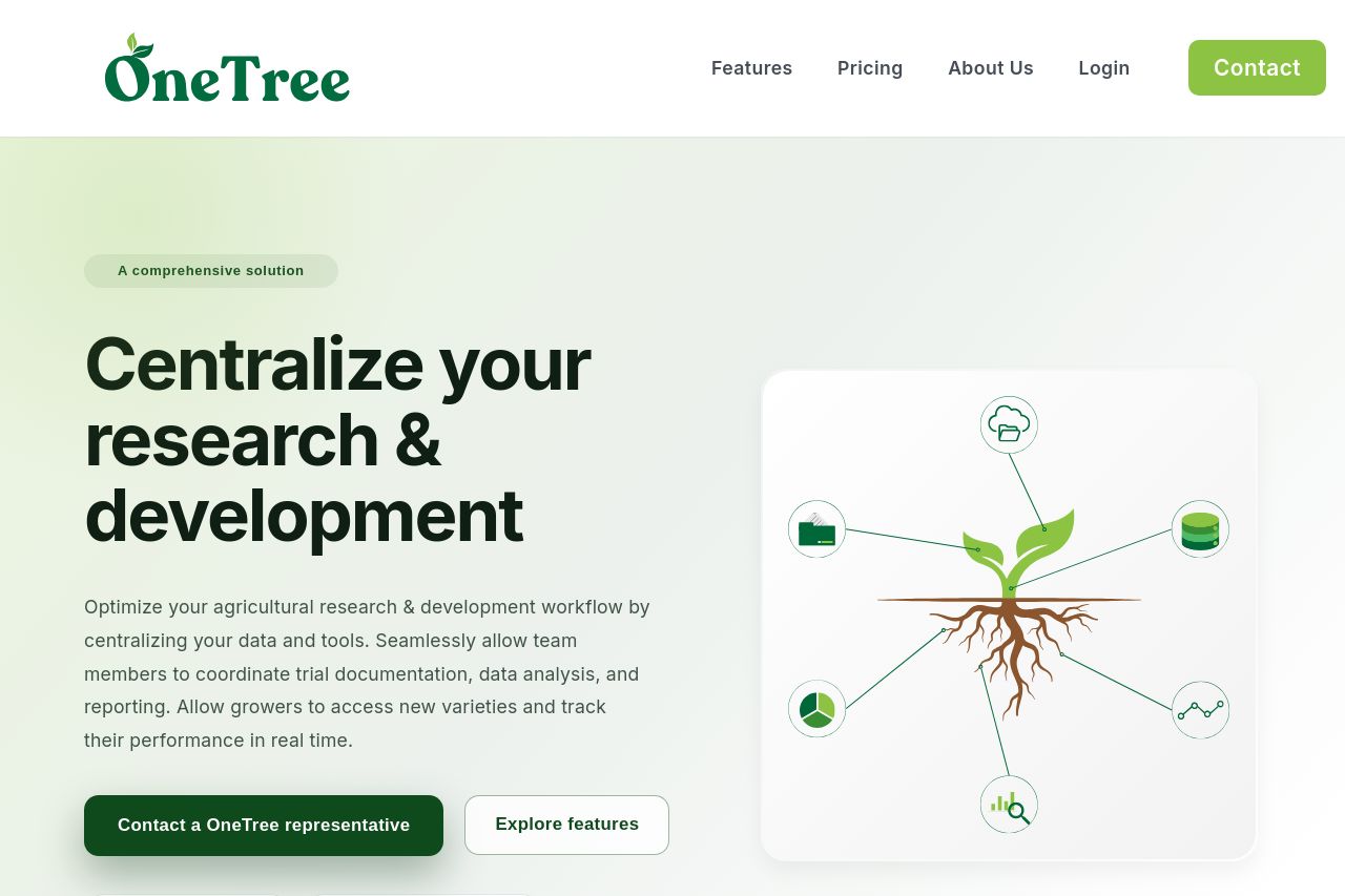
The main value proposition, "Centralize your research & development," is immediately visible, but the explanation beneath lacks explicit benefits and actionable insights that engage the audience effectively. The use of subheadings like "Season Analytics" and "Planning Workflows" is a good attempt at segmenting information, although not detailed enough.
The design is simple but borders on bland. While the color scheme aligns with the agricultural theme through soft greens, it doesn't do much to catch the eye or create urgency. Typography is basic and clean, aiding readability, but more could be done to break up the monotony and create a hierarchy.
Regarding actionability, the CTAs like "Contact a OneTree representative" are appropriately labeled but lack a sense of excitement or urgency. Their placement is reasonable but too standard and easily overlooked due to the overall muted page design.
Credibility elements are scarce. Aside from the professional appearance, there are no trust signals like testimonials or client logos, which can severely impact trust and conversion rates.
- Incorporate more vibrant and dynamic visual elements to grab attention immediately.
- Enhance the main value proposition with specific and clear benefits.
- Add testimonials or case studies to improve credibility.
- Revamp CTA wording to create urgency and excitement.
- Introduce distinct sections to guide the user through features effectively.