habitmap.app
Landing Page Analysis
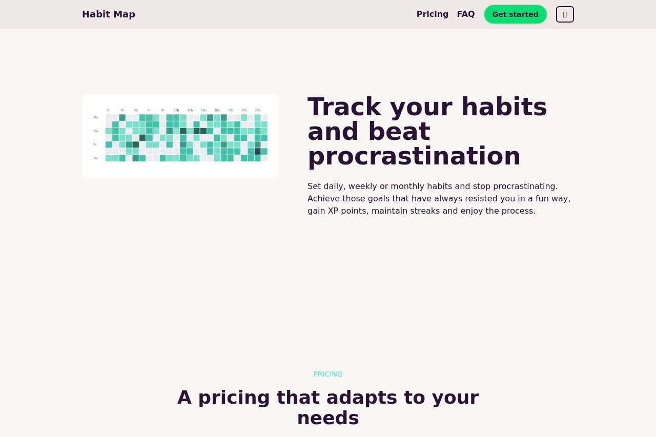
Track your habits and beat procrastination
63
Share on:
Summary:
50
Messaging
60
Readability
70
Structure
50
Actionability
70
Design
60
Credibility
The page has a straightforward design, but it suffers from a lack of engaging elements and depth in messaging. The value proposition is somewhat clear; however, the generic language lacks distinction, leaving the users guessing what makes this habit tracker better than others. The layout is clean but borders on looking dull. The CTA buttons are visible, but they could be more dynamic to truly capture user action. Pricing information is conveniently placed but lacks compelling persuasion. The FAQ section is useful but might benefit from more interactive elements. Overall, the design feels cohesive, yet it's missing the excitement and personalization needed to foster action.
Main Recommendations:
- Make the value proposition more distinct by emphasizing unique benefits that set it apart.
- Enhance the design with more engaging and dynamic elements.
- Improve the visual appeal and contrast of CTA buttons to make them more enticing.