myrecipefy.com
Landing Page Analysis
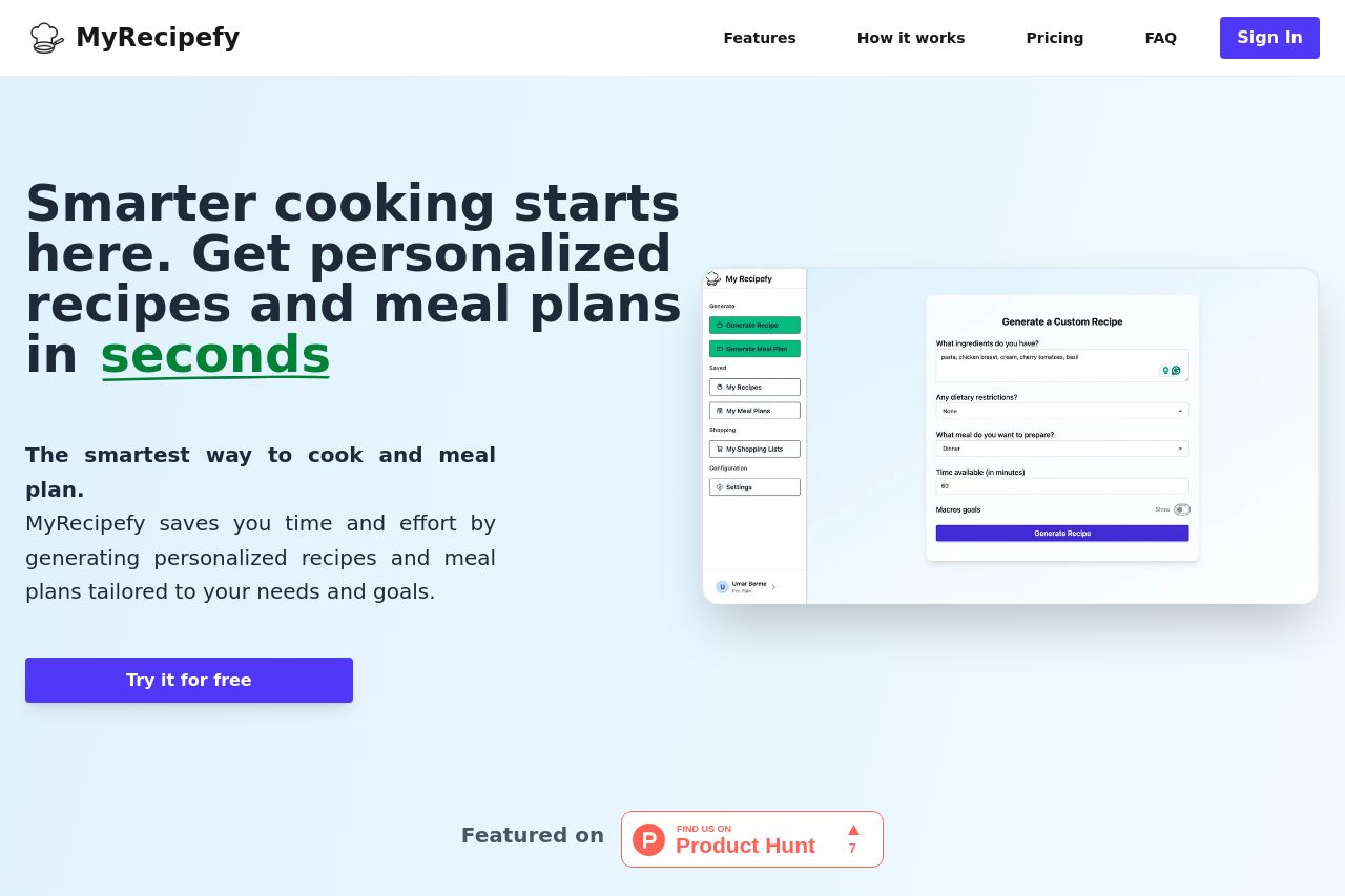
Instant personalized recipes and mealplans based on your ingredients and lifestyle.
77
Share on:
Summary:
72
Messaging
77
Readability
78
Structure
65
Actionability
85
Design
60
Credibility
MyRecipefy is impressively clear about its value proposition, offering personalized recipes quickly. The design is clean and professional, with a well-chosen color scheme and clear typography. The biggest issue lies in the repetitive and slightly uninspired copy. While informative, the language is bland and doesn't do much to engage the user emotionally. Several sections have redundant information, and the call-to-action needs to be more prominent to enhance conversion. Trust elements are present but could be stronger with more user reviews. Overall, the page is structured logically but needs more flair to truly captivate the target audience.
Main Recommendations:
- Enhance the call-to-action button so it stands out more against the background.
- Revamp the copy to make it more engaging and less repetitive. Use more dynamic language.
- Incorporate more testimonials or user reviews to build trust.