myscalev.com
Landing Page Analysis
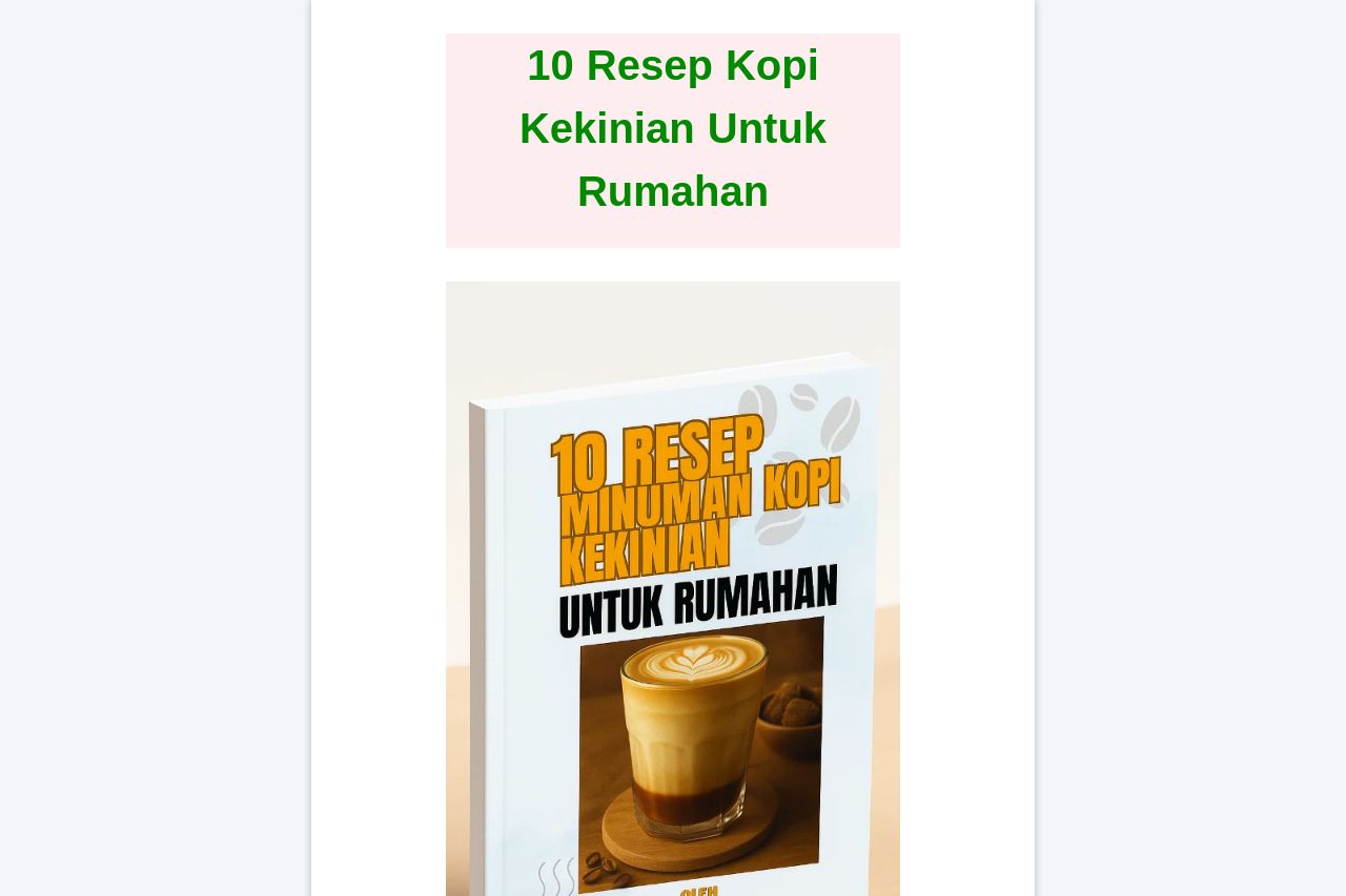
"E-book '10 Resep Minuman Kopi Kekinian untuk Rumahan' karya barista bersertifikasi BNSP. Resep kopi viral, praktis dibuat di rumah, cocok untuk ide usaha kopi modern.">
Summary:
The landing page presents a straightforward and engaging proposition: offering an e-book with trendy coffee recipes for home crafting. The simplicity of the message appeals directly to the viewer's interests in making coffee shop-style beverages at home. However, the layout feels a bit cramped and uninspired.
The hero section does a decent job of grabbing attention with an image of the e-book, but the text colors clash in terms of design. Some sections, particularly around pricing and bonuses, effectively communicate value, but the contrast between text and background isn't consistent, making it hard on the eyes in places. Testimonials or trust-building elements are lacking. This could be a missed opportunity to build credibility through social proof.
The calls to action are present, yet they lack urgency or unique positioning. The payment sections are clear and well-defined, providing clear options. The overall design feels a bit too plain; it could be spruced up with better color coordination and more compelling visuals.
- Add testimonials or reviews for credibility.
- Improve color consistency and contrast for better readability.
- Create a more visually engaging layout with attractive images and graphics.