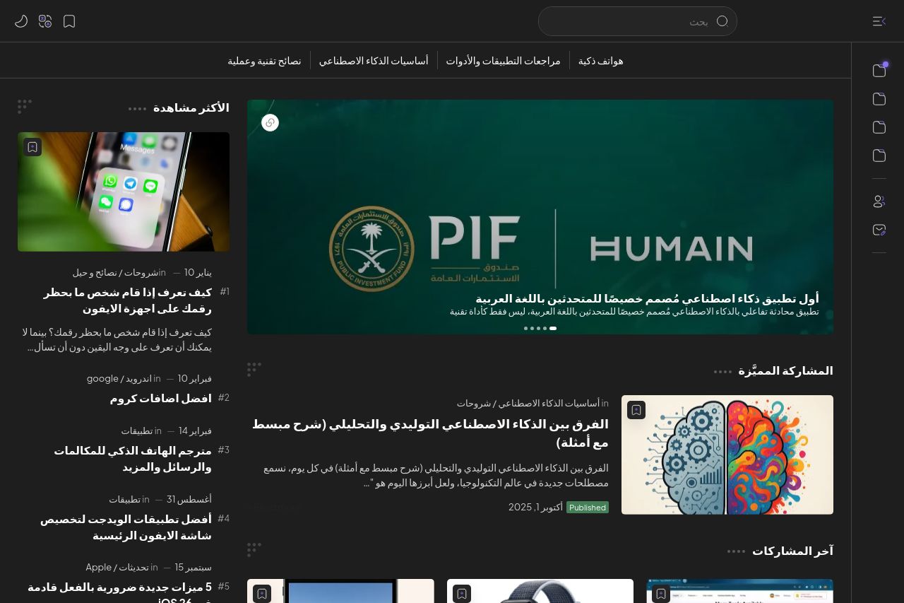
oenai.one
Landing Page Analysis
موجز إخباري ,في الوقت الفعلي لأحدث ,عناوين التكنولوجيا,والهواتف الذكية,والتطبيقات
63

Share on:
Summary:
50
Messaging
80
Readability
70
Structure
60
Actionability
70
Design
30
Credibility
The website has a sleek and modern design, but there are some key areas needing attention. The color scheme is consistent, but the dark mode might not appeal to everyone. Navigation is fairly intuitive, though some categories could have more clarity. The content is repetitive with tags and labels, which could confuse users. CTAs are visible but could stand out more. The overall design is professional, yet some elements like the cookie consent banner could be less obtrusive. Social proof and credibility elements are lacking, which might impact trust. The Open Graph data is also a missed opportunity, with elements that could be more engaging.
Main Recommendations:
- Enhance the visibility and clarity of CTAs with contrasting colors.
- Reduce repetitiveness in tags and labels for better clarity.
- Add trust elements like testimonials or client logos.