kodomo-gochimeshi.org
Landing Page Analysis
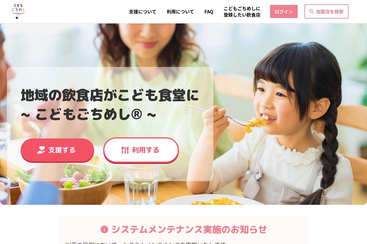
「こどもごちめし®」とは、地域の飲食店をこども食堂化し、こどもの居場所とまちの未来を育むサービスです。
73
Share on:
Summary:
60
Messaging
70
Readability
65
Structure
60
Actionability
65
Design
100
Credibility
The landing page has a warm, inviting theme but falls short in several key areas. The messaging is a bit repetitive and doesn't immediately grab attention, leading to a lack of urgency or clear direction for users. However, the social proof is strong with recognizable logos that add credibility. The design is soft and friendly, yet it lacks a bold visual hierarchy which can make some crucial information blend into the background. The CTAs are present but could be more action-oriented and distinctly placed to guide user actions more effectively. Overall, the site has a cohesive feel but lacks the punch that would make it truly effective.
Main Recommendations:
- Enhance the visual hierarchy to make call-to-action buttons more prominent.
- Clarify and simplify the main value proposition to quickly engage visitors.
- Add more dynamic and engaging visuals to break monotony and draw attention.