wrteam.in
Landing Page Analysis
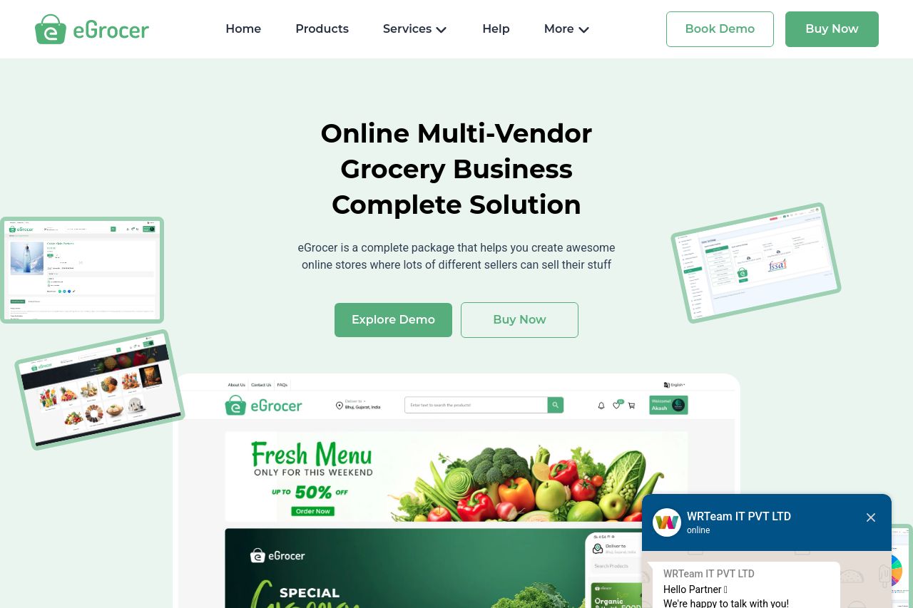
Start your multi vendor grocery delivery store with eGrocery. A Flutter app with Laravel admin panel, source code, and grocery store website template—perfect for on-demand delivery and ecommerce marke
Summary:
The landing page for eGrocer provides a coherent and professional design, but it struggles with messaging clarity and focus. The tone is somewhat generic and might not resonate deeply with target audiences like ecommerce store owners. The use of visuals is commendable; however, they can be overwhelming and sometimes distract from the main content. The CTAs are present but not always strategically placed, making the user journey somewhat disjointed. Information hierarchy feels cluttered with too many elements vying for attention at once, leading to potential cognitive overload. Credibility seems to be established well with clear social proof and pricing transparency, but the overall narrative could be more compellingly driven.
- Refine the main value proposition text to be more explicit about the key benefits and unique selling points of eGrocer.
- Improve CTA placement to guide users more logically through the purchase process, ensuring buttons are noticeable and inviting.
- Simplify the visual elements on the page to reduce clutter and enhance focus on essential information.