wixsite.com
Landing Page Analysis
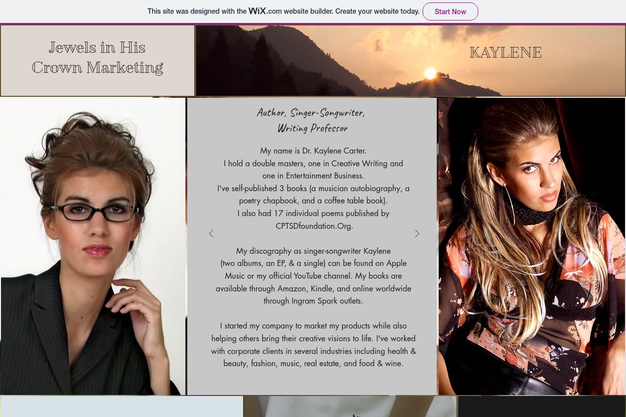
Jewels in His Crown Marketing
Summary:
The landing page feels cluttered and lacks focus. The text blocks are dense, making it tiring to read and process information quickly. The design tries to convey creativity through various artistic elements, but the inconsistency in formatting and structure takes away from professionalism. The tone doesn't align well with the audience—it's too casual without clearly establishing authority or expertise. Additionally, the CTA buttons do not stand out, blending too well into the background and thus being easily overlooked. The testimonials and previous clients are good for credibility, but they are not highlighted effectively to build trust. The imagery used seems unrelated and out of sync, not reinforcing the brand or message.
- Simplify and condense text blocks to improve readability and engagement.
- Ensure CTAs are clear, action-oriented, and visually distinct to catch attention.
- Improve design consistency in colors, fonts, and layout to enhance professionalism and clarity.