wixsite.com
Landing Page Analysis
The Deater Foundation
Summary:
This landing page is a mixed bag.
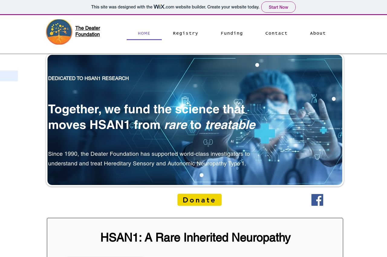
On the plus side, it covers an important and specialized subject matter, providing some well-chosen images and details about the Deater Foundation and its work on HSAN1 research. The inclusion of an image for the hero section adds some depth, and the presentation and researcher information align well with the topic.
However, there are significant issues impacting usability and effectiveness. The design feels outdated and overly reliant on a Wix template, which detracts from its professional impression. The glaring issues with alignment, color contrast, inconsistent fonts, and lack of polish in headings make the page feel cluttered. With a target audience of medical professionals, the messaging needs a clearer, more authoritative tone. The text blocks lack hierarchy and get lost on the page—this is problematic when the audience likely expects concise and actionable information.
The Call-to-Action buttons are somewhat buried and lack urgency and specificity, which affects engagement dramatically. Transparency and credibility are respectable, largely due to the visible names from the research community, though more recognizable trust indicators would help.
- Revamp the visual design to enhance professionalism and focus, using consistent fonts and better color harmony.
- Improve the readability and visual hierarchy by utilizing more headings, subheadings, and bullet points.
- Enhance the call-to-action by making buttons more prominent and verb-driven, like 'Explore HSAN1 Research'.