meumundodecores.com
Landing Page Analysis
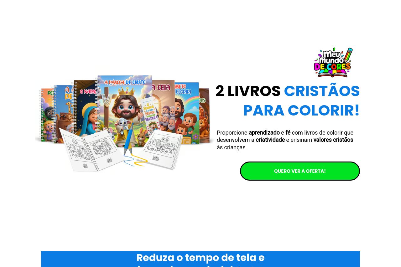
15 livros para colorir Cristãos
Summary:
The landing page attempts to engage its audience with vibrant visuals related to Christian-themed coloring books. The messaging is somewhat effective, focusing on creativity and Christian values, but it lacks clarity and precision in conveying the unique value proposition or why these books stand out. The repeated use of the same phrases, like "ALFABETO PARA COLORIR," dilutes the impact. Design-wise, the use of bright colors captures attention but can be overwhelming and clash in areas, which may distract rather than guide the user. The repeated use of different fonts and inconsistent text size disrupts the visual hierarchy, making it cumbersome to navigate. Credibility is bolstered by testimonials, yet some text appears cluttered, making it hard to extract key insights. The call-to-action buttons are strategically placed, but they don’t stand out due to the intense background colors. Overall, the page does not pay enough attention to creating a user-friendly experience that guides visitors seamlessly towards conversion.
- Simplify the key messaging to make the value proposition clear and succinct.
- Improve visual hierarchy by maintaining consistent font sizes and using color more subtly.
- Ensure the CTAs stand out more effectively against the background to attract attention.