com.br
Landing Page Analysis
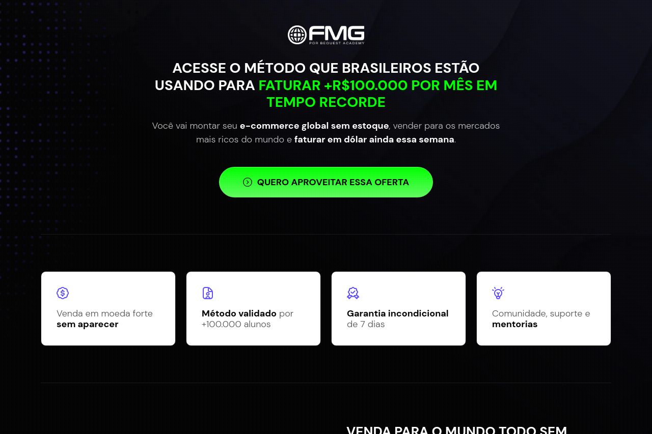
Você vai montar seu e-commerce global sem estoque, vender para os mercados mais ricos do mundo e faturar em dólar ainda essa semana.
Summary:
This landing page aggressively targets potential dropshipping entrepreneurs with bold claims, promising high earnings with little effort. The use of testimonials and case studies showcases success stories, but feels overwhelming due to the list-like manner they are presented. The color scheme is dark with flashes of neon green, creating an intense and urgent atmosphere, but it's bordering on overwhelming and might be off-putting to some users. The value proposition is clear, though somewhat inflated, playing heavily on the fear of missing out. Despite some strong hooks with testimonials, overall the page feels cluttered and lacks refined hierarchy making it harder to digest important information easily.
- Simplify and declutter the layout to improve focus and readability.
- Refine the color scheme to reduce intensity and improve readability.
- Organize testimonials in a way that is easier to digest, such as using more succinct summaries.