wrteam.in
Landing Page Analysis
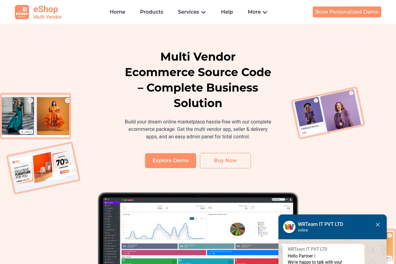
Build your multi vendor ecommerce platform with eShop. A flutter ecommerce app with admin panel and PHP script, source code, and multi vendor ecommerce template for a complete marketplace solution on
Summary:
The landing page for eShop tries hard, but fails to deliver on many fronts. While the value prop is easy to understand, the page is cluttered with generic buzzwords that do nothing to engage developers. Design-wise, you've slapped on multiple bold colors without any regard for consistency. It's like staring at a rainbow gone wrong. The structure is a jigsaw puzzle, leaving potential customers clueless about what's important. Then you've gone and buried the most crucial CTAs. Seriously, who thought hiding "Buy Now" was the way to sell something? Social proof? Non-existent. Do devs even want to trust this product? Nope, since professionalism and transparency took the day off, leaving a lackluster first impression.
- Simplify your value proposition to focus directly on the multi-vendor functionality instead of generic e-commerce buzzwords.
- Refine the CTAs to make them more visible and action-oriented, like "Get the App Now" instead of burying them in links.
- Use a consistent color scheme that doesn't overwhelm visitors with excessive contrast.
- Display social proof elements like client testimonials or recognizable logos to build trust.
- Reorganize the page to address developers specifically, focusing on technical details and the benefits of the app's features.