lonneberg.se
Landing Page Analysis
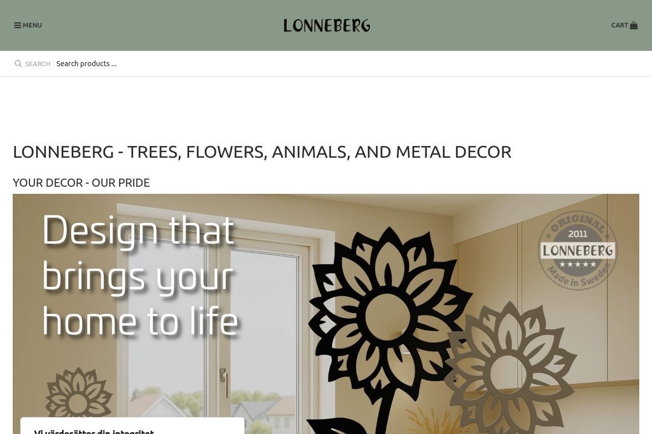
Discover our exclusive collection of high-quality interior products for homes, offices, and public spaces. Each product is designed in sustainable steel with minimal maintenance and long-lasting beaut
Summary:
Lonneberg's landing page isn't doing itself any favors. The messaging is vague and leaves you guessing what the site really offers. No strong value proposition is jumping out, and there's almost zero alignment with a particular audience.
The readability is a mess. Overly long sentences and jargon clutter the site's purpose. There's a severe lack of visual clarity, making the content hard to digest. You'd be lucky to find a properly placed call-to-action.
Design-wise, it's like a mishmash of colors and fonts fighting for attention. There's no hierarchy guiding the eye, and inconsistency reigns supreme.
The structure is disjointed. Information hops around without any logical flow, making it a task just to figure out what you're looking at.
Actionability? Forget it. Calls-to-action, if present, aren't compelling or easy to spot. Credibility is sorely lacking. Notably absent are trust elements such as badges or testimonials.
- Define and communicate a clear value proposition visibly at the top.
- Reorganize content to have a logical flow, emphasizing critical information first.
- Improve the design with a consistent color scheme, clear typography, and balanced white space.
- Enhance CTA visibility with specific and action-oriented text, strategically placed.
- Add social proof elements such as testimonials or trust badges to build credibility.