com.br
Landing Page Analysis
© 2024 Centro Educacional Miraflores. Todos os direitos reservados.
67
Share on:
Summary:
60
Messaging
70
Readability
65
Structure
55
Actionability
55
Design
80
Credibility
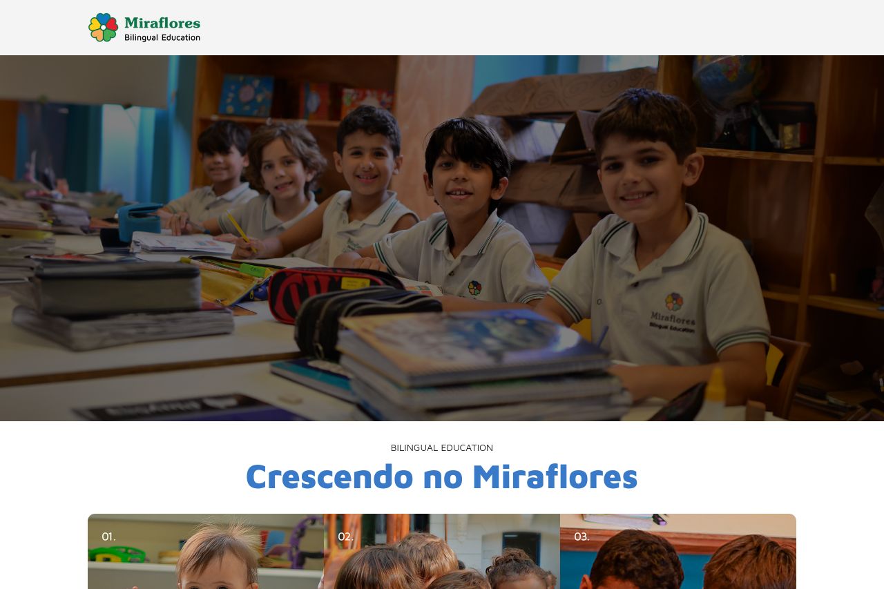
The page has a decent layout that's easy to follow, highlighting various educational stages at Miraflores. The images are engaging and relevant, showcasing an inviting atmosphere. However, redundancy in design elements like repeated WhatsApp buttons can be distracting. The typography is consistent but doesn't utilize existing hierarchy effectively. There's clear information for each educational stage, yet the overall design feels a bit stale and lacks a standout element to captivate the user. The use of bilingual text is commendable, but the lack of open graph data suggests missed opportunities for improved sharing and SEO presence.
Main Recommendations:
- Enhance the visual hierarchy to make key sections pop more.
- Vary the calls to action to avoid repetition and increase engagement.
- Include more interactive elements or dynamic content to keep users engaged.