synseria.com
Landing Page Analysis
We build AI-powered sales infrastructure that automates prospecting, qualifies leads, and scales revenue. Custom systems you own, not rent. Launch in 45-60 days.
Summary:
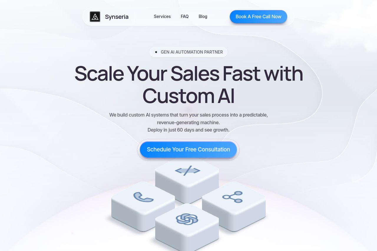
The website presents a sleek modern look but lacks substantial depth in some areas. The value proposition is clear, focusing on AI-driven sales acceleration, which is a huge positive. The design elements are consistent and create a professional veneer, although the lack of section differentiation might lead to some user fatigue.
On the flip side, the messaging could be more persuasive. Although the tone is professional, some sections feel a bit generic and don't fully capture the B2B CEO audience's attention. The use of visual hierarchy is decent but not exceptional, with some headings blending into the body text.
CTAs like "Schedule Your Free Consultation" are clearly indicated, but they aren't well-differentiated throughout the page. The credibility section does well, with logos of well-known companies adding trust, but the site could benefit from more testimonials or detailed case studies.
- Enhance visual hierarchy by using more distinct font sizes or weights for headings.
- Include more tailored content or case studies to better resonate with the B2B audience.
- Improve CTA differentiation to capture user attention at various touchpoints.