webnexs.com
Landing Page Analysis
Generated by create next app
Summary:
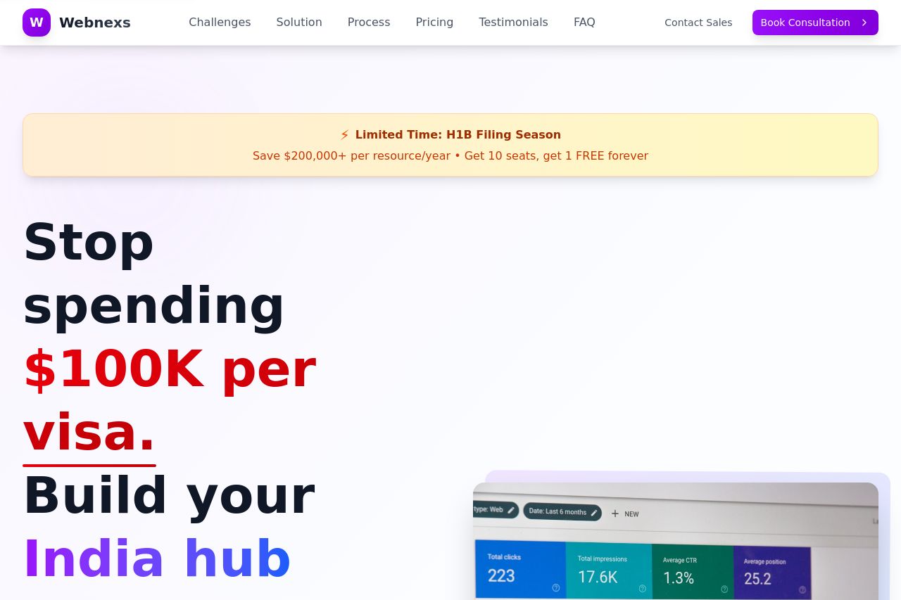
The landing page for Webnexs presents a decent layout and a clear message, but there are noticeable areas for improvement. The value proposition is evident, focusing on reducing visa costs and establishing operations in India. However, the text can feel a bit cluttered and overwhelming due to the heavy use of different colors and font sizes. The design feels consistent but lacks refinement in visual hierarchy, making it difficult to discern the most important elements at a glance. Sections flow logically, but there's some redundancy in the message, and call-to-action buttons, although visible, could be more compelling. The credibility is bolstered by testimonials and client logos, enhancing trustworthiness, but the page features too many options for action, which might confuse visitors.
- Simplify the color scheme by reducing the use of varying colors in text and headlines.
- Improve the visual hierarchy by prioritizing important elements with size and placement contrast.
- Consolidate messages to avoid redundancy and enhance impact.