wcart.io
Landing Page Analysis
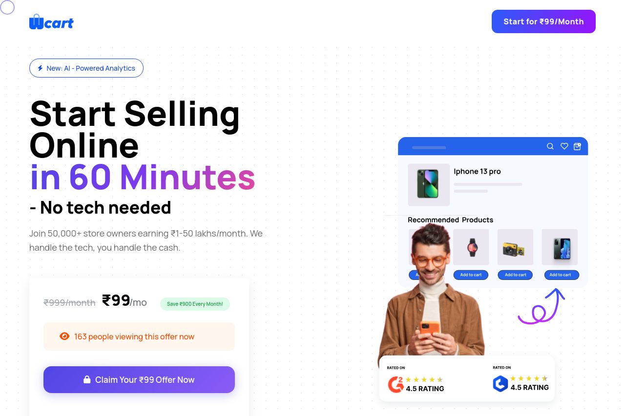
Join 50,000+ store owners earning ₹1-50 lakhs/month. We handle the tech, you handle the cash. Start for ₹99/month.
Summary:
The landing page effectively communicates its core message with a bold, action-oriented headline emphasizing quick setup and ease of use. The benefits and features are clearly articulated and visually supported, contributing to a strong value proposition. However, the text could be streamlined for easier consumption, and some elements, like CTA placement, need adjustment for optimal effectiveness. While the design maintains consistency and professional polish, some areas could use improved readability and less clutter. The credibility is enhanced with social proof and consistent design, but transparency details could be more explicit. Overall, the page does a solid job, but there's room for refinement to maximize impact and actionability.
- Simplify text in the hero section for quicker understanding.
- Reorganize CTAs for clearer guidance.
- Enhance transparency with clearer contact and policy information.