synseria.com
Landing Page Analysis
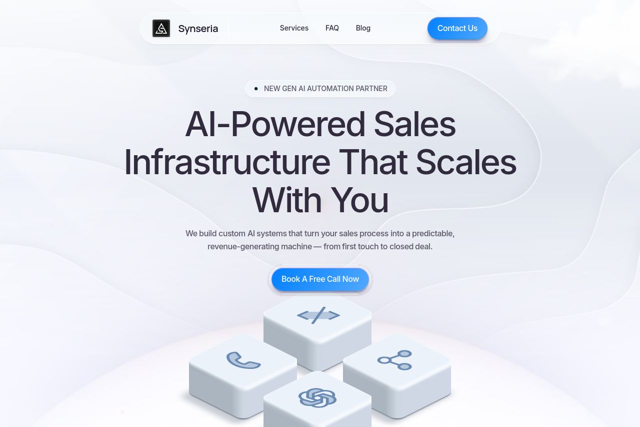
We build AI-powered sales infrastructure that automates prospecting, qualifies leads, and scales revenue. Custom systems you own, not rent. Launch in 45-60 days.
Summary:
The website presents a sleek modern design with a clear emphasis on AI-driven sales solutions, complete with some trust indicators from known brands. However, it dives quickly into AI jargon which might lose some less tech-oriented decision-makers. The visual design is balanced, but the color scheme might be too muted, causing the CTAs to blend in instead of standing out. The messaging, while clear in its intentions, lacks in conveying unique customer benefits loudly enough—a crucial misstep in the competitive AI sales niche. The CTA, "Contact Us," is weakly action-oriented, missing a chance to prompt immediate engagement. The open graph data exhibiting a clear headline and relevant description is well-structured yet uninspired in its appeal.
- Enhance CTA to be more action-oriented and specific, like 'Schedule Your Free Consultation' to increase engagement.
- Highlight more unique benefits and use specific customer success stories in messaging to emphasize value.
- Revamp color contrast on CTAs to ensure they stand out more against the background, prompting quicker action from users.