figma.com
Landing Page Analysis
or
42

Generated on:
September 29, 2025Score:
42/100Audience:
ecommerce sellersShare on:
Summary:
35
Messaging
75
Readability
30
Structure
45
Actionability
40
Design
10
Credibility
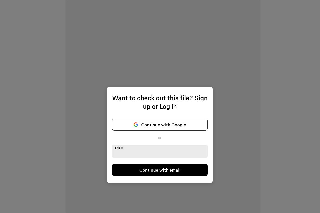
This landing page is incredibly basic, to the point it feels bare-bones. The only thing you see is a straightforward login prompt. The use of an explicit call to action, "Continue with Google" or "Continue with email," is functional but utterly unremarkable. There's no flair or attempt to persuade the user. While clarity is maintained, it's so stark that it might actually discourage users. The absence of any narrative or reason why a user should log in is a missed opportunity. Uninspiring would be an understatement here. The Open Graph data is equally uninspired, with no description or images, killing any chance of being enticing when shared.
Main Recommendations:
- Add a compelling reason to log in, explaining the value of the content behind the login.
- Incorporate an engaging visual or graphic to make the page less sterile.
- Improve Open Graph data to enhance appeal when shared on social media.