ofertasreligiosa.com
Landing Page Analysis
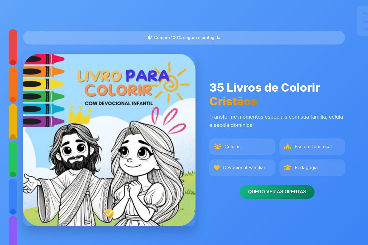
Transforme momentos especiais com sua família, célula e escola dominical. 35 livros de colorir cristãos únicos para fé e relaxamento.
Summary:
This landing page does a decent job of hitting the target audience with its colorful and inviting design, which is perfect for appealing to parents, teachers, and religious educators.
However, the call to action ("QUERO VER AS OFERTAS") lacks urgency and distinction from other elements, leading to potential confusion.
The use of icons is a nice touch but feels overused, which could lead to a reduced impact in terms of guiding the user’s journey.
The color scheme and imagery align well with the Christian theme of the product, offering warmth and friendliness.
The testimonials section is poorly executed—lacking engaging visuals—and looks broken with placeholder images.
The pricing section is informative but the contrast between different offers is not striking enough to catch the user's eye immediately.
While some information is clear, headings could be more consistent in font size and weight to better guide readers through sections. The social proof is good, but more credibility elements like trust badges could elevate confidence in the product further.
- Revamp the testimonials section with genuine, eye-catching visuals.
- Make the call to action buttons visually distinct with better positioning.
- Improve the pricing comparison by using stronger contrast and layout adjustments.