meumundodecores.com
Landing Page Analysis
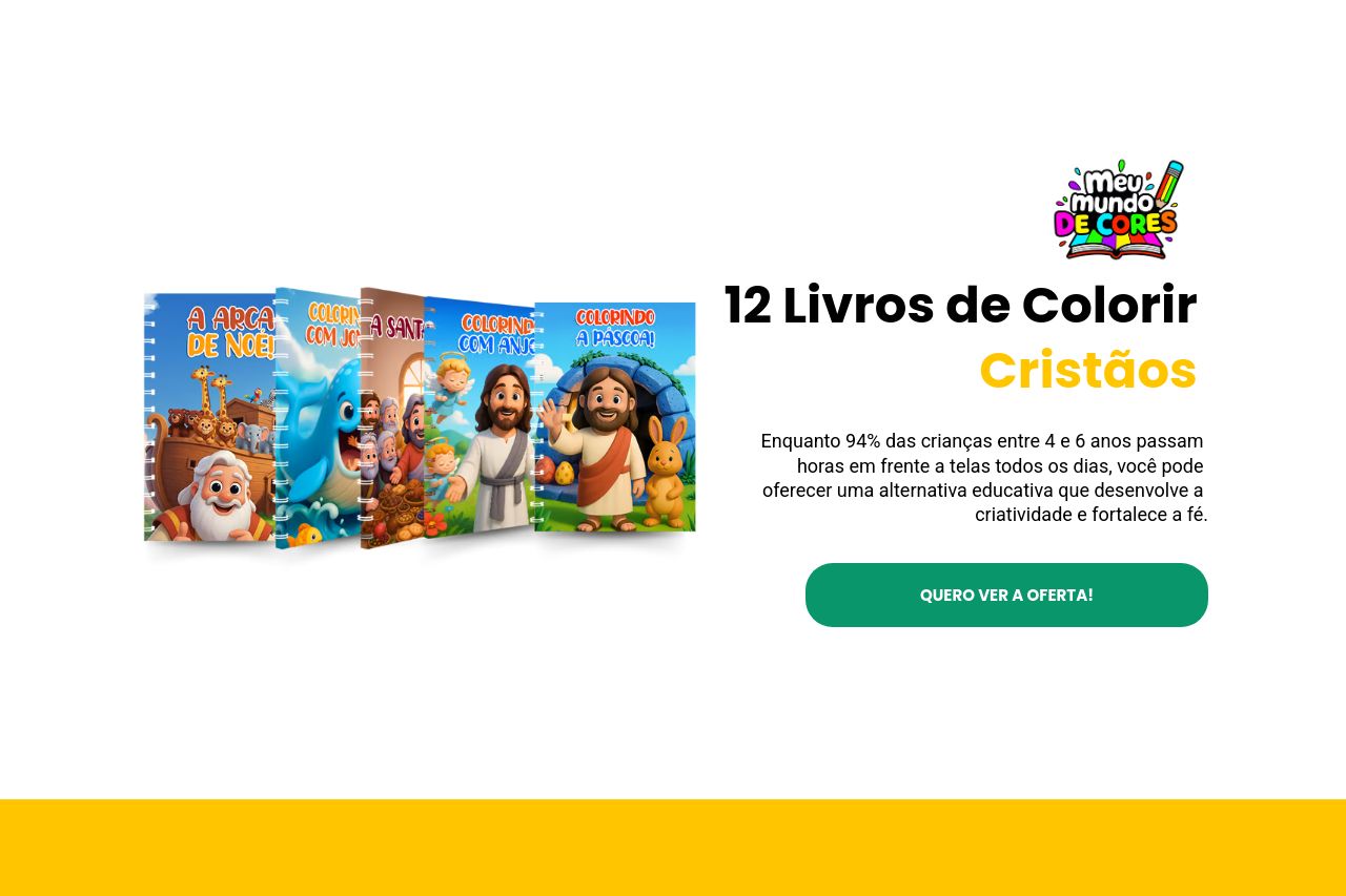
15 livros para colorir Cristãos
Summary:
The landing page for "Meu Mundo de Cores" has a strong emphasis on the educational value of coloring books with a Christian theme, targeting parents and educators. The vibrant and appealing use of colors in the design aligns well with the child-friendly theme. However, the section structure is often inconsistent, with some cluttered information, particularly in the visuals and text blocks.
The value proposition could be clearer from the start as the main headline doesn't strongly communicate the unique benefits. There is a notable use of testimonials and trust badges, which boost credibility. However, the pricing section is a mess with missing or unclear details, like the pricing strike-through not having a valid comparison. Call-to-action buttons are present but not always ideally placed or highlighted. Lastly, the use of multiple colors and inconsistent typography compromises readability in some areas.
- Clarify the main value proposition in the hero section to attract immediate attention.
- Revise and organize pricing information to avoid confusion regarding discounts and actual costs.
- Improve CTA placement and visibility by using contrasting colors to make them stand out.