tunedintowellness.com
Landing Page Analysis
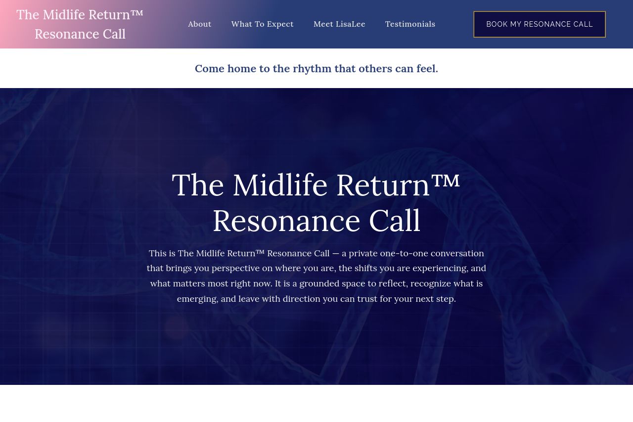
This is The Midlife Return™ Resonance Call — a private one-to-one conversation that brings you perspective on where you are, the shifts you are experiencing, and what matters most right now. It is a g
Summary:
Overall, this landing page attempts to convey a sense of calm, introspection, and guidance, but lacks in delivering both clarity and compelling elements to fully convert visitors.
The color scheme is soothing and aligns with the theme of wellness and introspection, but the visual hierarchy suffers due to inconsistent typography and lack of emphasis on the most crucial information. The messaging is vague and not persuasive enough to make potential clients eager to "Book My Resonance Call." The lack of clear, action-oriented language in the calls-to-action limits its effectiveness.
There's a lot of space that could have been utilized to better explain what makes the service unique and why someone should choose it over alternatives. Testimonials are included, which helps build some level of trust, but more concrete outcomes and fewer vague promises would enhance credibility.
Lastly, the page’s structure seems to wander as much as it guides. Content needs more coherence to maintain reader interest and build a logical flow to the ultimate call to action.
- Clarify the main offer and its benefits by elaborating on the outcomes of the Resonance Call.
- Make the CTA more action-oriented and visually distinct to increase conversions.
- Improve content flow and organization to enhance the reader's journey through the page.