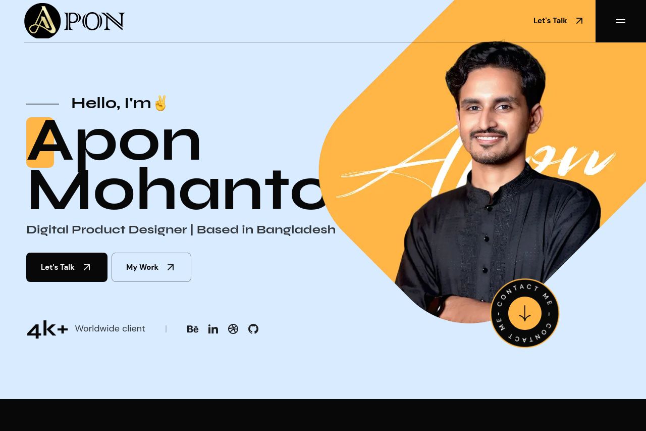
aponmohanto.com
Landing Page Analysis
Digital Product Designer | Based in Bangladesh

Summary:
The landing page for Apon Mohanto offers a visually appealing introduction with effective use of bold typography and color contrast. The main value proposition is clear, showcasing Apon as a digital product designer based in Bangladesh. The site includes crucial elements such as client logos, project samples, and testimonials, which enhance social proof. The hierarchy is well-structured with sections logically following one another. However, several areas need improvement: the overall experience could benefit from more engaging CTAs with clearer action verbs, reduction of repetitive or overly vague section headings, and a more professional-looking consistency across graphic elements. Inconsistent font styling and excessive use of orange highlights detracts slightly from readability and professionalism. Improving these areas can enhance communication and user engagement.
- Improve CTA wording to be more actionable and specific.
- Enhance typography consistency across different sections.
- Reduce the overuse of bright colors to improve readability.