hyperexponential.com
Landing Page Analysis
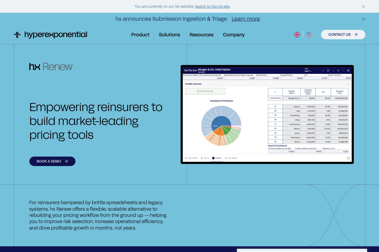
hx Renew is a flexible, scalable pricing and underwriting platform helping leading reinsurers improve risk selection and drive profitable growth.
Summary:
The landing page excels in delivering a clear message to its targeted audience of reinsurers, emphasizing how hx Renew can revolutionize their pricing and risk selection. The headline "Empowering reinsurers to build market-leading pricing tools" immediately communicates the value proposition, catering effectively to a niche audience. The page maintains a consistent professional tone suitable for the financial industry. However, the design feels somewhat flat due to limited color variations and lack of visual hierarchy. The heavy reliance on similar colors and fonts can make important information and CTAs merge into the background, reducing their impact. The dense text blocks challenge readability, and the repetitive use of privacy notice pop-ups disrupts the user's focus. CTAs like "BOOK A DEMO" could use more compelling, action-oriented language. Credibility is well-established through testimonials and recognitions, but the overall visual aesthetic needs enhancement to match the strength of the content.
- Enhance color contrast and hierarchy to make key elements like CTAs more prominent.
- Simplify text blocks into more digestible pieces using bullet points or lists.
- Revise CTAs to be more action-oriented and specific to encourage user engagement.