hyperexponential.com
Landing Page Analysis
Achieve superior combined ratios with hx Renew – the only pricing system that moves at the speed of our market.

Summary:
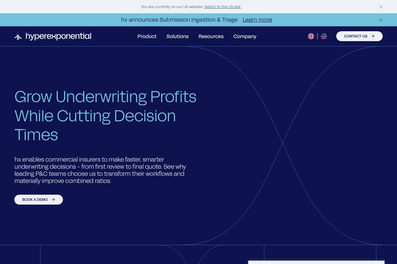
The hyperexponential landing page aims to communicate a clear value proposition, emphasizing efficiency in underwriting for commercial insurers. The main message is concise, but the industry jargon could alienate less technical visitors. Visually, the consistent color scheme and typography are appealing, though they risk monotony. The layout supports readability, but repeated cookie consent pop-ups severely hinder user experience. CTAs are well-defined but lack urgency. Credibility is bolstered by customer logos and case studies, enhancing trust. However, the overall design lacks a certain flair that could make the page more engaging.
- Simplify the language to appeal to a broader audience.
- Reduce the frequency of cookie consent pop-ups.
- Add more dynamic design elements to break visual monotony.