hyperexponential.com
Landing Page Analysis
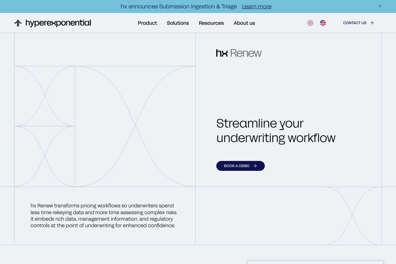
hx Renew transforms pricing workflows so underwriters spend less time rekeying data and more time assessing complex risks.
Summary:
The landing page of Hyperexponential is sleek and professional, with a focus on clear communication and an organized structure.
The value proposition is clear, but it could use more specific client testimonials or recognitions to enhance credibility. The design is cohesive, with a consistent color scheme and typeface that aligns with professional aesthetics.
Navigation is straightforward, allowing users to easily digest the content. However, the text could be more concise, and some CTAs could stand out more to be truly effective.
Overall, this is a well-executed page but could improve in making the CTAs more prominent and refining some sections for clarity.
- Make the CTAs more prominent. Use bold colors that stand out against the background.
- Add specific client testimonials or case studies to boost credibility.
- Condense text in sections to enhance readability and impact.