pixlnexs.com
Landing Page Analysis
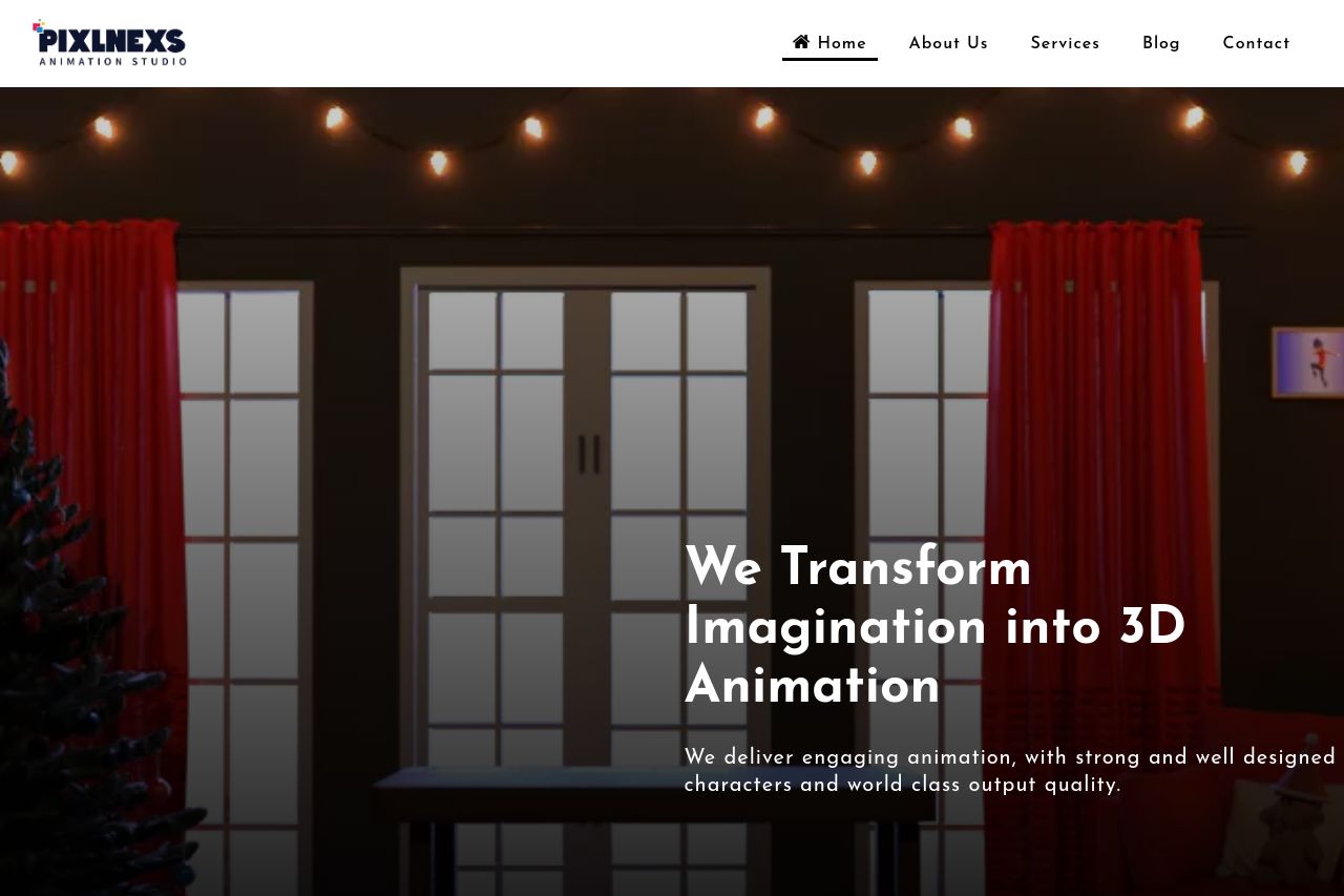
Pixlnexs is the best among 3D animation studios that offer a wide range of animation services that empower how you tell stories to your clients.
Summary:
Pixlnexs' landing page attempts to present itself as a top-tier 3D animation studio. The layout is somewhat clear, but the design suffers from inconsistency, with contrasting styles and mixed imagery that don't quite harmonize. The value proposition is somewhat vague, lacking clear examples or demos to back up the grand claims. While there’s an attempt to showcase processes and services, the sections feel scattered and could use more cohesiveness. Heading visibility is lacking, making navigation cumbersome, although efforts were made with menus and sections. Calls to action are present but fail to stand out, suffering from repetitive text and poor placement. The lack of strong social proof or testimonials severely impacts credibility.
- Clarify the main value proposition with concrete examples or demos.
- Enhance the visual hierarchy and consistency in design elements.
- Improve CTA visibility and placement to drive user actions.
- Add genuine testimonials or client logos to build credibility.
- Ensure headings guide users more effectively through content.