skinsolutionscanberra.co
Landing Page Analysis
Trusted By 1000+
Summary:
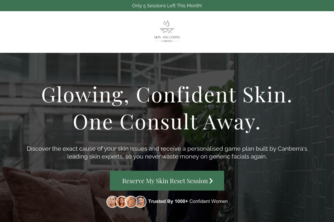
The landing page for Skin Solutions Canberra does a commendable job of targeting its audience with clear messaging and trust-building elements. The hero section effectively sets the tone with a bold headline and urgency-inducing text like "Only 5 Sessions Left This Month." The call-to-action (CTA) is placed strategically and stands out with "Reserve My Skin Reset Session." The inclusion of testimonials adds credibility. However, there are areas that beg for improvements. The typography and layout could use more visual clarity, especially in text-heavy sections that can become overwhelming. The color palette lacks contrast, which could hinder readability. Additionally, the navigation through sections could be more intuitive, particularly for mobile users. Lastly, while the content's tone aligns well with the audience, it occasionally borders on being too verbose, potentially muddling the main message.
- Enhance typography contrast for better readability.
- Improve mobile navigation for better user experience.
- Shorten verbose sections for clearer messaging.