hookjawfishing.com
Landing Page Analysis
Gear crafted for passionate fishermen and daring outdoor enthusiasts, fueling your adventures and elevating those moments spent in nature.
Summary:
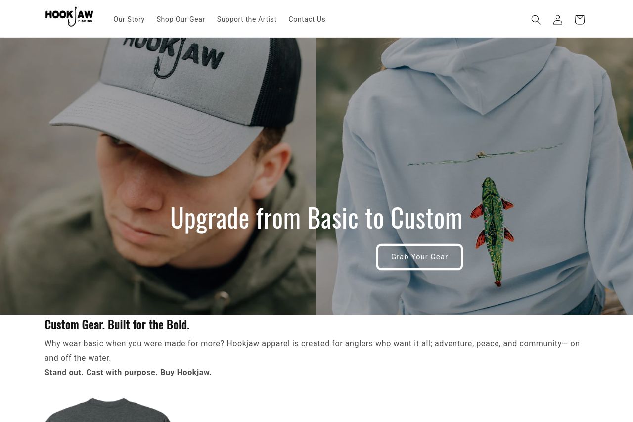
The landing page for HookJaw Fishing has a decent vibe, but it’s screaming for some polish. The main value proposition, "Custom Gear. Built for the Bold," is prominent, but the following text fails to connect with the emotional aspects of the user experience. The CTA "Grab Your Gear" does not stand out, lost in the simplicity and lacks punch. In terms of aesthetics, everything feels a bit too bland and dull, making the page somewhat forgettable. The imagery and colors align with a fishing theme, but the lack of contrast makes it feel sleepy instead of vibrant. There are meaningful chunks, but it all feels somewhat static.
Once you get past the hero section, there’s a lack of engaging content to keep the user interested. The product images are straightforward, but they lack context or storytelling that might entice a visitor to explore further. It’s frustrating when there's potential that’s just not being tapped.
The site does not scream professionalism and trust, mainly due to a lack of elements like customer reviews or testimonials displayed prominently. This omission can leave potential buyers hesitant. The contact options are good, but there's nothing groundbreaking. There’s no brilliant blend that makes you stop and go, "Hey, this is superb." Instead, it’s just coasting along with the bare minimum.
- Increase the contrast in colors to make the page more dynamic and engaging.
- Revise CTAs to be more action-oriented and enticing.
- Add more storytelling elements around the products to engage users.