hookjawfishing.com
Landing Page Analysis
Gear crafted for passionate fishermen and daring outdoor enthusiasts, fueling your adventures and elevating those moments spent in nature.
Summary:
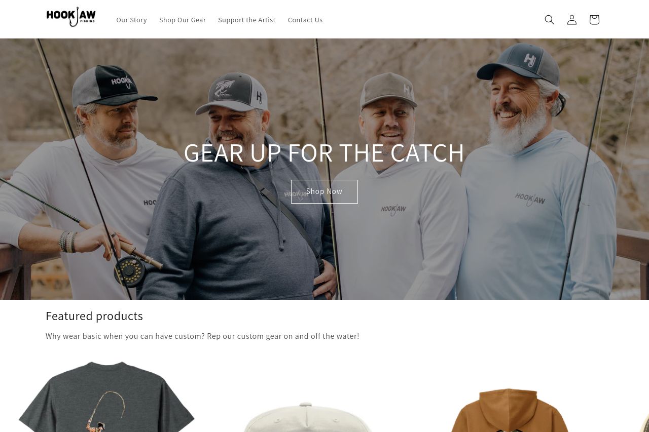
The landing page for HookJaw Fishing has a decent vibe, but it can't coast on that alone. The hero section is engaging with its "GEAR UP FOR THE CATCH" headline, which clearly targets fishing enthusiasts, yet it lacks any sense of urgency or standout offers that might push someone to "Shop Now."
Design-wise, the contrast is solid, but could be more daring—the colors are tame and don't really pop, which a bold brand should aim for. Typography is a missed opportunity; everything feels very flat with little hierarchy, so nothing really grabs attention.
The product section is somewhat bland. Images are okay, but there's no appeal—it's all just there. It needs more interaction or lively descriptions to make the products desirable.
The reviews do the credibility some good, but come across as filler text, lacking any depth or story that hooks the audience more.
Overall, the text is easy to read and the tone matches the intended audience, but the entire page lacks energy and focus. There's not enough to pull someone in and keep them there. Everything feels a bit too generic.
- Create a more engaging hero section with bolder, more urgent CTAs.
- Enhance visual hierarchy by diversifying typography to make key information stand out.
- Amp up the appeal in the product section with dynamic descriptions or interactions.
- Integrate more compelling and detailed testimonials to build trust.