otassessed.co
Landing Page Analysis
referrals@otassessed.com.au
Summary:
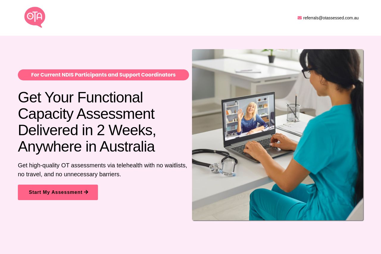
The landing page effectively communicates its main value proposition, focusing on delivering OT assessments quickly and conveniently. It's clear and straightforward but lacks a bit of visual flair. The call-to-action buttons stand out, encouraging immediate engagement. However, the tonal consistency feels overly formal, missing a chance to connect more personally with users. The design, while professional, is basic and could benefit from more dynamic elements to catch the eye. The structure is logical, though slightly text-heavy, which might deter less patient visitors. Social proof is well-used, with testimonials enhancing credibility, but lacks visual diversity. Overall, the page gets the job done but could elevate the user experience with better design touches and engaging copy.
- Add more engaging visuals or icons to break up text-heavy sections.
- Introduce more dynamic design elements to enhance visual appeal.
- Consider a slightly warmer tone in the copy to create a stronger connection with the audience.