mindstategroup.com
Landing Page Analysis
Microsoft Virtual Events Powered by Teams
Summary:
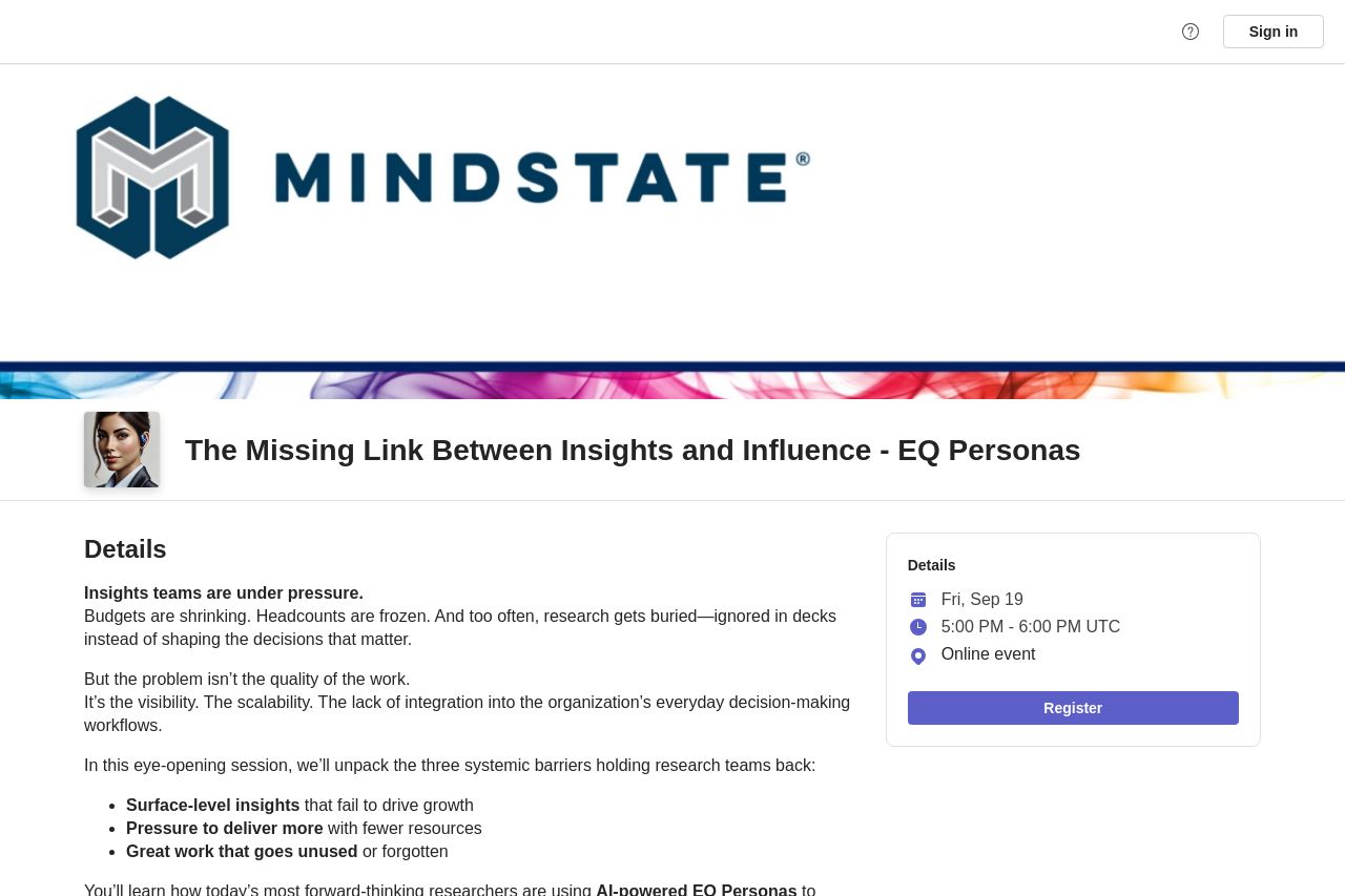
The landing page for the event, "The Missing Link Between Insights and Influence - EQ Personas," lacks clarity in visual hierarchy and engagement, making the overall experience disjointed and less engaging than it could be. The messaging is buried under blocks of text, and the lack of a striking visual element makes it forgettable. Typography and layout are bland, with not enough emphasis on what’s important. The value proposition is buried, with no real highlight or compelling call to action.
Design elements are overly bare, failing to capture the user’s attention or stand out. The color scheme is too simplistic, with a lack of strong contrast or exciting visual elements to differentiate sections and guide the viewer.
Structure is generally coherent but could use more pointed headings for easier navigation. The information is too dense and doesn't flow optimally, forcing readers to sift through blocks of text to find value.
Actionability is limited due to weak CTAs that do not stand out and fail to entice immediate action. They are poorly placed and do not guide the user through a journey.
Overall, the page feels muted and could be vastly improved with attention to design and clearer, more engaging messaging.
- Improve visual hierarchy by using larger, bolder text for key messages.
- Enhance the color scheme to create more contrast and guide action.
- Simplify and streamline the messaging for faster comprehension.
- Improve CTA placement and design to make them more prominent and enticing.