synergycloud.io
Landing Page Analysis
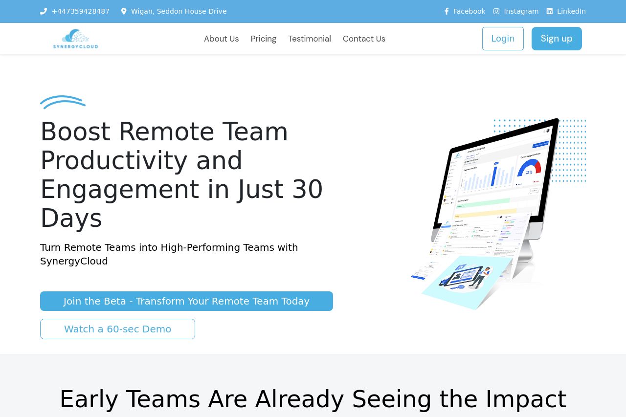
Transform your remote work experience with our collaborative platform. Build stronger teams and create a happier workplace, no matter where your employees are.
Summary:
The landing page for SynergyCloud attempts to convey a strong value proposition around enhancing remote team productivity. However, it falls flat on several fronts. The messaging is repetitive and lacks punch, making it hard to grasp the unique selling point quickly. There’s an excess of generic buzzwords without meaningful context, resulting in a disconnect with potential users. Visuals are bland with an overuse of similar colors which detracts from the page’s vibrancy. The design feels slightly chaotic with inconsistent use of fonts and weighting, and the layout lacks a coherent flow that guides the user. Furthermore, the CTAs do not stand out as intended, and there’s no clear urgency or motivation for immediate action. Social proof elements are present but not utilized to their full potential, leaving a void in establishing robust credibility and trust.
- Clarify the unique value proposition with more precise language.
- Enhance the contrast and color usage to make important elements pop.
- Improve visual hierarchy by using varying font sizes and weights.