myntra.com
Landing Page Analysis
Please contact your administrator
12

Share on:
Summary:
10
Messaging
20
Readability
10
Structure
5
Actionability
10
Design
10
Credibility
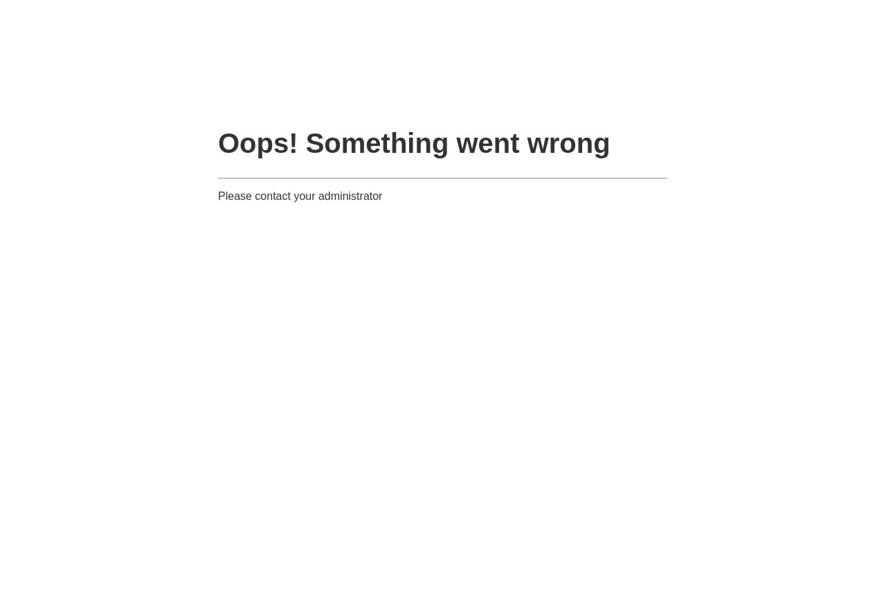
This error page is a prime example of a missed opportunity.
The message "Oops! Something went wrong" lacks any helpful information or guidance, leaving users confused and possibly frustrated. The font choice is generic and doesn't convey any brand identity, essentially making it a wasted space. The simple instruction to "contact your administrator" without any further details or contact information is ineffective at best.
No design elements, images, or branding are present, which results in an uninspired and dull appearance. This could deter users from returning.
Main Recommendations:
- Include more detailed error information or potential fixes.
- Add brand elements like logo and color scheme to maintain brand identity.
- Provide direct contact details or a support link.
- Consider adding a friendly illustration to soften the error impact.