flicknexs.com
Landing Page Analysis
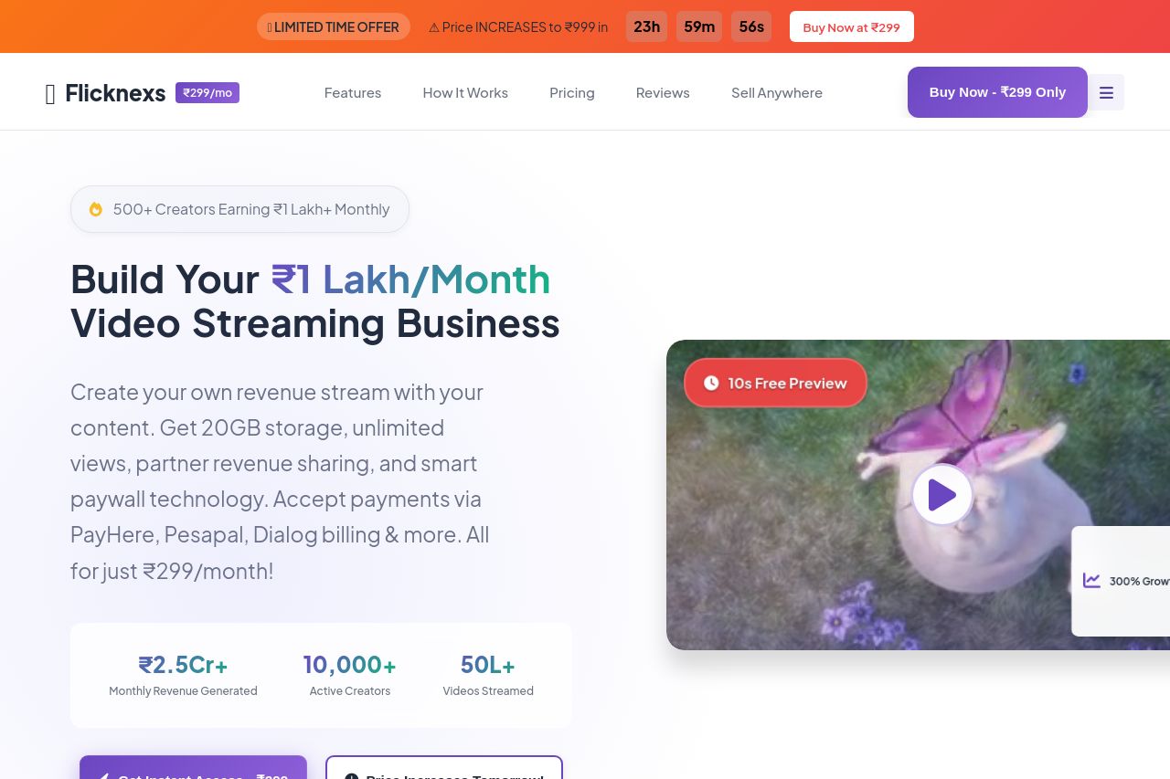
Create your own Netflix-like platform with Flicknexs. Earn ₹1 Lakh+ monthly with Partner Revenue Sharing. 20GB storage, unlimited views & sharing. Only ₹299/month!
Summary:
The landing page for Flicknexs presents a decent layout and a clear value proposition but is overwhelmed with content, making it feel cluttered and difficult to digest. It prominently displays urgency and scarcity tactics but overdoes it, making them seem less credible. The tone is appropriate for its target audience, with a focus on empowering creators. However, the messaging seems repetitive and overly optimistic, which could come across as disingenuous. The design uses bright colors effectively, but the overwhelming amount of information and misalignment in visual hierarchy can confuse users. Credibility elements like testimonials and customer success stories are present, but the excessive focus on unrealistically high revenue projections may reduce trust. Overall, the site lacks finesse in structuring and presenting its key messages, making it hard for users to quickly grasp the information they need.
- Reduce the clutter by streamlining content and focusing on key points.
- Limit the number of scarcity tactics to enhance credibility.
- Provide a more balanced representation of potential earnings to build trust.
- Improve the visual hierarchy with clearer distinctions between headings and body text.