sharkclean.com
Landing Page Analysis
Shark® POWERDETECT™ Upright Vacuum with DuoClean Detect™ Technology - The Shark® POWERDETECT™ upright vacuum combines the most powerful suction with ultra-powerful hair pick up and cutting-edge DuoCle
Summary:
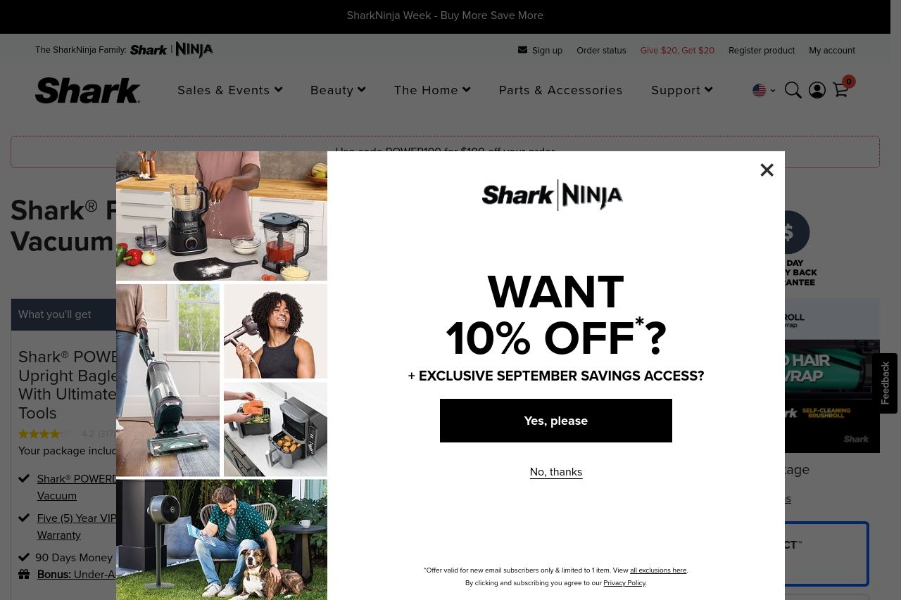
The landing page is cluttered and distracting. The overlay for the 10% discount is intrusive and dominates the screen, potentially driving visitors away. The design is inconsistent; while some fonts are readable, others feel out of place and overwhelming. Messaging is overly verbose, especially in product descriptions, making it hard to extract key information quickly. The CTAs are not prominent enough in the overall chaos. Positive elements include the mention of a 90-day money-back guarantee which builds trust. However, the complex language used in features and descriptions could alienate a broader audience.
- Redesign the overlay to be less intrusive, perhaps with a subtle slide-in.
- Simplify the feature descriptions to be more digestible.
- Make CTAs stand out more and ensure consistency in fonts and colors.