shocals.com
Landing Page Analysis
Get started from offline to online selling in Chennai. Manage your online business from everywhere and reach more customers.
Summary:
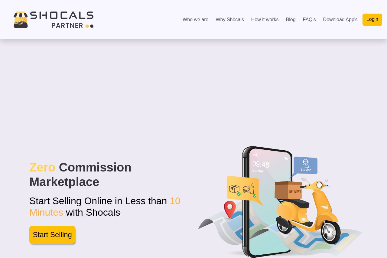
The page's hero section gets right to the point with its bold value proposition: "Zero Commission Marketplace." This immediately captures attention and makes the offering clear. The placement of the "Start Selling" CTA button is prominent and invites action, but the design misses some opportunities to enhance engagement. The color contrast between the text and background could be more striking to improve readability. The imagery is relevant, supporting the message with an illustration that speaks to the digital nature of the service. However, the design feels somewhat generic and lacks distinctive flair, which might cause it to fade into the sea of similar offerings. Consider refining the visuals and enhancing the typography to make the page more appealing and engaging.
- Improve text contrast for better readability.
- Enhance visual appeal with more engaging graphics.
- Refine typography for a more professional look.