shocals.com
Landing Page Analysis
Shocals unites trusted local stores to bring you the best products, right from your neighborhood.
43
Share on:
Summary:
50
Messaging
40
Readability
35
Structure
20
Actionability
30
Design
70
Credibility
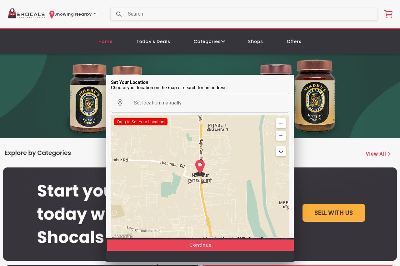
The page struggles with clarity and focus. The "Set Your Location" pop-up dominates the screen, potentially frustrating users. The background is cluttered with jewelry images, distracting from the main content. There's an attempt to use bright colors for the CTAs, but they clash with the overall design, creating a chaotic feel. It's a visual mess! Lots of information is cramped into one area, with overlapping elements that make navigation confusing. The lack of proper headings and visual hierarchy means users have to work hard to find what they need. The site could use a makeover, but there's some potential beneath the chaos.
Main Recommendations:
- Redesign the layout to focus on a cleaner, more structured user journey.
- Enhance CTA visibility with a more cohesive color scheme.
- Simplify the location setting process to improve user experience.