wcart.io
Landing Page Analysis
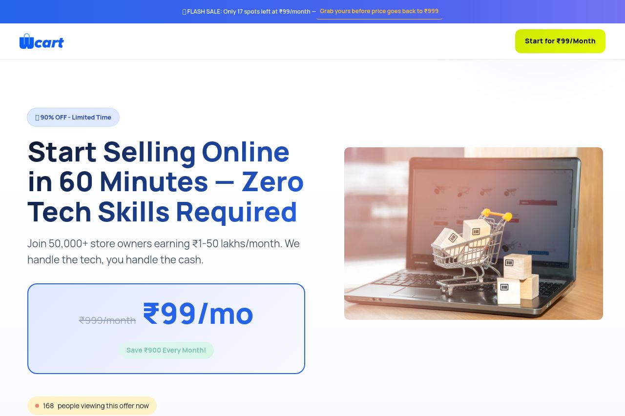
Join 50,000+ store owners earning ₹1-50 lakhs/month. We handle the tech, you handle the cash.
Summary:
The landing page for Wcart does a decent job at showcasing its main value proposition, which is simplicity and affordability for selling online, as emphasized by "Start Selling Online in 60 Minutes — Zero Tech Skills Required." The pricing and urgency with offers such as "₹99/mo" and timers are meant to drive action but may feel overly salesy and potentially deceptive if seen too frequently. The page structure is generally logical, with testimonials, features, and a comparison table supporting the offer.
However, a more sophisticated audience may find the messaging too simplistic and lacking depth about technical specifications or advanced features. While the design is clean, the use of color could be improved to make key elements stand out more. The repeated urgency elements can also clutter the focus of the page. Social proof and testimonials are a strong point, bolstering credibility, yet more detailed case studies or specific outcomes would add assurance for potential customers.
- Simplify messaging to avoid sounding overly salesy and focus more on genuine benefits.
- Improve the contrast and emphasis on key elements using better color discrimination.
- Reduce repeated urgency elements to avoid clutter.