jobos.ai
Landing Page Analysis
Apply to 100,000+ jobs with one click using Jobos.ai's AI-powered automation. Save 10+ hours weekly & get 3x more interviews. Try free today.
Summary:
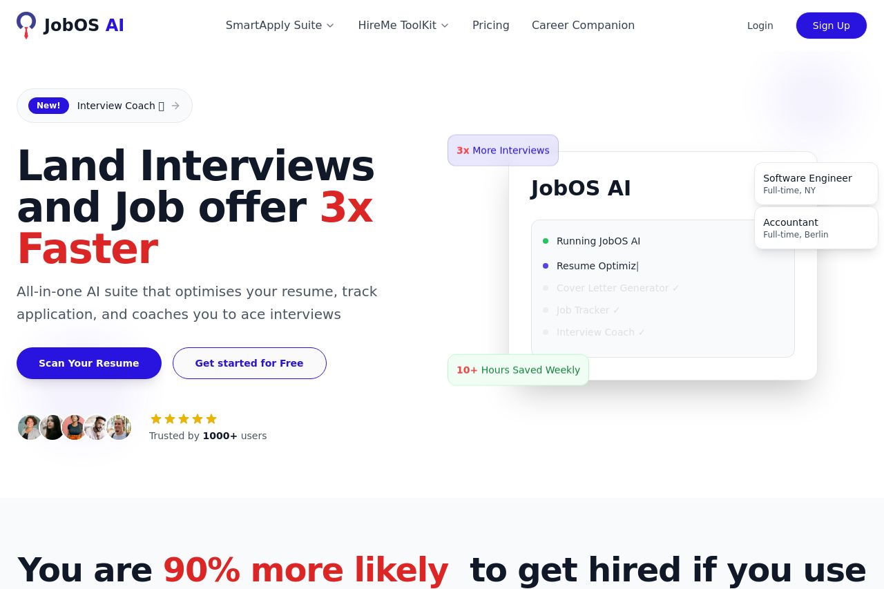
The landing page is visually appealing and starts with a strong headline that clearly communicates the value proposition: "Land Interviews and Job offers 3x Faster." The inclusion of social proof like user testimonials enhances credibility. However, there's a lack of depth in explaining the features and benefits of the product, leaving potential users guessing. The text is generally simple but lacks a varied presentation to maintain engagement throughout the page. The CTAs, like "Scan Your Resume" and "Get started for Free," are action-oriented but are placed in such a minimalist manner that they don't stand out as they should. The color scheme is pleasing, but it can benefit from greater contrast, especially between the CTAs and the background to enhance visibility and actionability.
- Add detailed explanations and visuals for each feature to improve user understanding.
- Enhance CTA visibility with contrasting colors or larger buttons.
- Improve the open graph data to ensure the page is shareable with a descriptive title, image, and description.