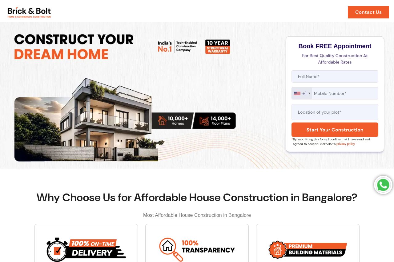
bricknbolt.com
Landing Page Analysis
Avail the most affordable house construction . Enjoy end-to-end construction services, including customised designs and quality execution. Book a free consultation today!
85

Generated on:
September 16, 2025Score:
85/100Share on:
Summary:
84
Messaging
75
Readability
90
Structure
65
Actionability
78
Design
95
Credibility
The landing page has a clear focus on establishing trust and credibility, featuring multiple CTAs that encourage immediate action. The emphasis on trust elements such as testimonials, project numbers, and partner logos is strong. However, the design feels monotonous with repetitive CTAs and not enough variety in typography or color to create interest. Some sections, like the pricing and projects, could be more visually engaging. The content is somewhat scattered, making navigation a bit tedious.
Main Recommendations:
- Add variety to CTA design to avoid fatigue.
- Improve typography by varying font sizes and weights.
- Highlight key information with visual cues to enhance clarity.