heyo.so
Landing Page Analysis
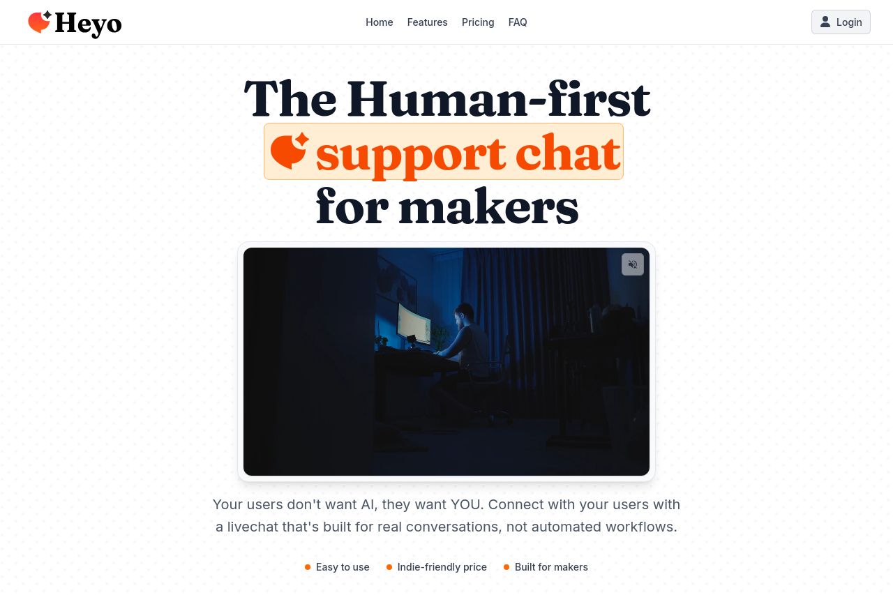
Skip the bots and automation. Connect authentically with your customers through livechat built for real conversations.
Summary:
Overall, the landing page is cohesive and visually appealing, with some strong elements, but there are areas needing improvement. The main value proposition is clear, stating the focus on human-first support, well-targeted at makers and small teams. The tone is engaging, matching the casual, yet professional style expected by founders. However, the readability can be improved—text blocks could be broken down for easier digestion. The design follows a consistent theme and good use of color highlights key areas, but it lacks sufficient visual hierarchy in some sections. The CTA is prominent but could stand out even more. Credibility is backed up by social proof, but more detailed testimonials could strengthen trust. Lastly, the Open Graph data is missing, which can impact social sharing efficiency.
- Break up long text blocks for improved readability.
- Enhance visual hierarchy to guide users more effectively.
- Improve Open Graph data with a catchy title and description.