kelme.nl
Landing Page Analysis
Leave your mark
Summary:
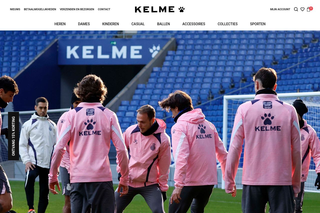
The Kelme website looks visually appealing with high-quality images showcasing a variety of sports gear, which immediately conveys the brand's focus. However, the site lacks distinctiveness in messaging, offering no unique value proposition that sets it apart from competitors. There's imagery overload with sports teams and products, but not enough textual explanation or customer-centric stories that highlight benefits or motivate community bonding. The user journey feels scattered, with Call to Actions like "Ontvang 15% Korting" that might not stand out enough, lacking urgency or specificity.
Despite having clear product classifications, the readability factor is hampered by clutter, with too many navigation options and product blocks densely packed together. This distracts users from focusing on key offerings. The site does well in presenting its trust indicators like partnerships but fails to inspire engagement through personalized content or any notable brand storytelling. The tone feels too mechanical and generic, missing a warmer or more engaging narrative style that could resonate better with their apparent target market.
- Enhance the main value proposition by clearly stating the unique benefits and features of Kelme products.
- Reduce visual clutter by spacing out elements and organizing CTAs better, ensuring they are more visible and actionable.
- Strengthen the narrative tone to make it more engaging and relatable to the target audience, possibly through customer stories or testimonials.