com.au
Landing Page Analysis
Looking for removalists in Hobart? Shaggy Group can help you with commercial or house removals. Affordable prices, contact us now!
Summary:
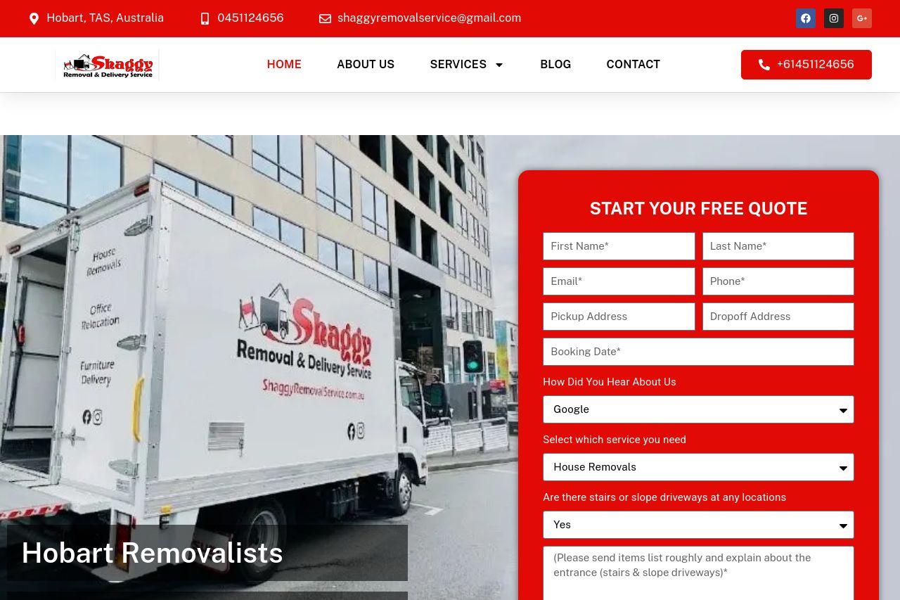
Overall, Shaggy Removal Service's landing page does a decent job at showing their service offerings with various sections dedicated to highlighting different aspects of the business. However, the overwhelming amount of text tends to clutter the page, detracting from its effectiveness. The hero section has an eye-catching image but is overly crowded with a large form right away, which could be seen as too aggressive for some users. The color scheme is overly intense, using red to an extent that can dominate the user's focus, making it difficult to distinguish between different sections quickly. The testimonials and credibility indicators work well in building trust, but the copy throughout the page is excessively verbose and lacks sharp, focused messaging aligned with a direct call to action. The hierarchy is inconsistent, and some elements don’t stand out enough while others are too pronounced, leading to a mixed visual experience.
- Simplify the text in sections by condensing the information to make it more digestible.
- Add more formatting elements like bullet points or numbered lists to break up large blocks of text.
- Decrease the intensity of the red color to make CTAs and important information stand out more.