shipybara.com
Landing Page Analysis
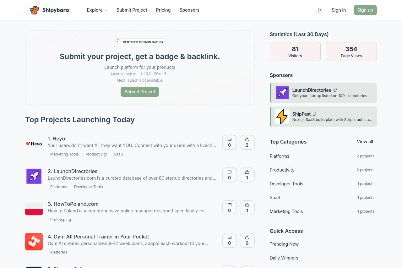
Shipybara is a platform to discover and upvote the best tech products. Find top products launching daily.
Summary:
Shipybara has a clean and straightforward design, but it's lacking in some key areas. The value proposition could be stronger; "Submit your project, get a badge & backlink" doesn't scream excitement or urgency. While the feature listing is clear, it can appear too bare if there aren't many projects listed, as in the "Yesterday's Launches" and "This Month's Best" sections.
Readability is decent, with easy-to-read fonts and good spacing, but it sometimes falls into monotony due to the lack of bold or distinct headings.
Design-wise, there's a good foundation, but the attractiveness is compromised by the dull color scheme and overused whitespace. Actionability is confusing. The CTA "Submit Project" is prominent, but it lacks a sense of urgency or uniqueness to tempt users to act immediately.
Social proof is virtually non-existent apart from the sponsor logos—big miss there. Navigation and structure are intuitive, but the empty sections make the page feel outdated.
- Strengthen the main value proposition with clearer benefits and urgency.
- Enhance visual appeal by using a more engaging color palette and varied typography.
- Add testimonials or success stories to build credibility and trust.