shophighnoonhouse.com
Landing Page Analysis
Discover premium hemp-derived gummies, herbal teas, CBG at High Noon House. Natural wellness products - elevate with organic herbs
Summary:
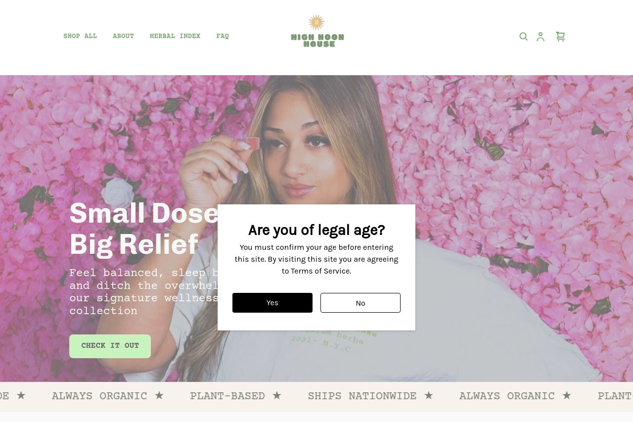
The landing page for High Noon House attempts to blend a casual aesthetic with a focus on premium hemp-derived products, but there are considerable flaws that need attention. The constant pop-up for age confirmation is obnoxiously intrusive and distracts from engaging with the actual content, killing user experience. The design has some pleasant elements like the color scheme aligning well with wellness themes, but consistency wavers at times, making everything look a bit haphazard. Messaging is well-intentioned with clear product focus, yet the tone sometimes misses the mark, lacking the soothing vibes you'd expect for a wellness brand. While there's an attempt to add credibility and communicate value, it's undermined by the lack of strong visual hierarchy and overly generic headings. Overall, it's not awful, but it’s not hitting the high notes it needs to resonate with its target audience.
- Remove or limit the intrusive age confirmation pop-up.
- Enhance text simplicity and break up long paragraphs.
- Improve visual hierarchy with better typography and layout adjustments.